Book Review: John Joseph Adams’ The Living Dead

Thirty-four tales about zombies in this horror anthology which are gruesome, sweet, or simply too terrible to review.

Thirty-four tales about zombies in this horror anthology which are gruesome, sweet, or simply too terrible to review.

I received this book for free from in exchange for an honest review. This does not affect my opinion of the book or the content of my review.Secrets: The Best in Women’s Erotic Romance, Vol. 6in a paperback edition that was published by Red Sage Publishing Inc on December 1, 2000 and has 224 pages.Explore it on Goodreads or Amazon There are four romances in this anthology. Series “Love’s Prisoner” (Wyndham Werewolf, 1) “A Candidate for the Kiss” (Vampires, 6) The Stories Sandy Fraser’s “Flint’s Fuse” This finds Flint kidnapping his boss’ daughter, Dana Madison, to keep her out of trouble while Madison finishes up a major business deal. A month of pure torture for both. For different reasons. This was cute, but too clichéd to really catch my interest. Fraser had Dana doing a too-abrupt one-eighty on her feelings toward Flint much too easily. There was no build-up, no finesse. MaryJanice Davidson’s “Love’s Prisoner” This finds Michael Wyndham trapped in an elevator with Jeannie Lawrence on the cusp of the full moon. And she smells too good to ignore. Clever and cute especially with Michael’s complete openness with Jeannie and his pack. Too funny. Alice Gaines’ “The Education of […]

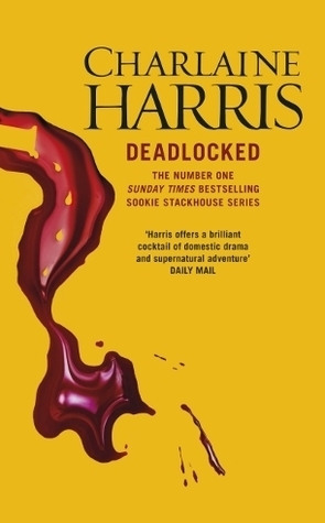
There’s a thing or two she’d like to say about Eric Northman feeding off another, younger! woman, but she has to keep quiet — Felipe de Castro, the vampire king of Louisiana (and Arkansas and Nevada), is in town. It’s the worst possible time for a human body to show up in Eric’s front yard–especially the body of the woman whose blood he just drank.

All Charles “Shake” Bouchon has to do is deliver a “package”. A wholesome young housewife named Gina who’s run afoul of Dick “The Whale” Moby, a murderous 300-pound strip club owner.

A customer unhappy about a love charm brings wizard lawyer Trevor Barnes to town to sue Stasi Romanov, a witch running a lingerie shop with that oops of a sideline.

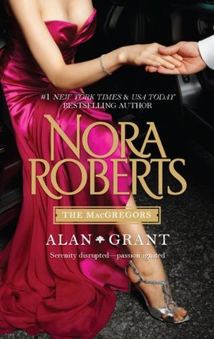
Combines two classic stories from the MacGregor family saga: “All the Possibilities” and “One Man’s Art.

She was the most beautiful British bauble in Europe’s jet-set playground. Now she’s broke, furious, and limping down a backwoods road in an ugly pink Southern Belle gown. He was tall, lean, and All-American gorgeous. He liked his brews cold and women loved to keep him warm. So why is he stopping his car for this woebegone, surly Scarlett?

As a wealthy few gather to bid on a predator capable of destroying all life on earth, the sorcerers of the Twenty Palace Society mobilize to stop them. All Ray has to do is survive until help arrives. But it may already be too late.

An anthology with one short and one long from Feehan’s Dark Saga series, revolving around two De La Cruz brothers in Brazil who find their lifemates.

Ran across this article by Nathan Ford, Applying Macrotypography For A More Readable Web Page which I thought was very well done. It addresses important basics on where to be cautious in your font choice and where to let loose, considerations for line-height as well as the best line length, tips on helping your text stand out even on a busy page, and suggestions about color choices. Ford also makes an excellent point about the “pretty” of the web page. That the intention is to create a page your viewers will enjoy reading (without squinting!). That’s primary. Once you have a readable layout, it’s up to you to provide your so-very readable text with a pretty layout. Always keep your target audience in mind—the older the viewer, the bigger the font-size! *As I creakily push my glasses back up my nose…*