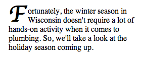
A dropped-cap is that enlarged first letter of a paragraph that “drops” down two or more lines and may use a fancy font. Be sure to choose a font that complements your topic! While I wouldn’t use a gothic font for a scientific paper, I would use it in a gothic horror story. And while I’d find Helvetica rather dull for a romance, it could be perfect for a non-fiction reference book.
That said, dropped-caps are generally used in novels at the beginning sentence of a chapter with the height of it varying from two to five sentences down.
It can be a pretty little trick to create a dropped cap effect at the start of a paragraph and creating this effect is actually very simple.
Return to top
Exploring More . . .
You may want to also look at more possibilities for fun in Building Your Author Website“.
Return to top
Build Your Author Website is . . .
. . . an opportunity to do a bit more with your author’s website or blog and have some fun with it. All while learning something about HTML (hypertext markup language) and CSS (cascading style sheets) — the easy way, lol.
If you found this post on “Adding a Flourish with Drop Caps” interesting, consider subscribing to KD Did It, if you’d like to track this post for future updates.
Return to top
| Drop Cap |
| Part of Web Building: Fun Stuff |
| Definition: A large letter to mark the start of a text.
On a website, a drop cap mostly makes a flourish even as it marks important passages and guides readers through the text.
If you want to create an atmosphere of traditional, elegant, or historic, a drop cap is handy.
POST CONTENTS:
A.k.a. initial cap
|
| Adding a Drop Cap |
| Rule: Use to mark a new section or indicate a new chunk of text.
|
| The CSS |
| CSS |
Appearance |
.dropCap {
float:left;
width: 0.8em;
font-size: 300%;
font-family: Apple Chancery, cursive;
line-height: 60%;
font-weight: bold;
} |
 |
| The Code |
The Analysis |
| .dropCap { |
. indicates that you are modifying a tag
As a class, it is ideal to use when you want to make a small change
dropCap provides a class name that modifies a tag and can be applied to any HTML tag by including class ="text" inside the HTML <> brackets |
| float: left; |
Dictates where an image or a text will appear in another element. Default values include left, right, and none. In this case, it pulls the initial cap in tight with the smaller text. |
| width: 0.8em; |
width sets the numeric value for the initial cap. Use em to set this value so it is will adjust to the size of the viewer’s screen. Do play with this number as it affects the amount of white space between the large initial cap and the following text. |
| font-size: 300%; |
Font-size sets the size of the font. You want this initial cap to be large. Play with the numbers to achieve the effect you want. |
| font-family: Apple Chancery, cursive; |
Font-family is a fail-safe…although I’m not playing it too safe as I’ve embedded this font in the website and you are only seeing a screenshot. |
| line-height: 60%; |
Line-height sets the distance between two lines. In this case, it pulls the regular text in close around the large initial cap. Again, play with the numbers to explore the effects. |
| font-weight: bold; |
Font-weight has a range of values including bold, bolder, lighter, normal, and 100 through 900.
When working with a cursive font, I prefer a stronger weight. |
|
|
Return to top or post contents
|
| The HTML |
| HTML Code |
Analysis |
| <p><span class=”dropCap”>F</span>ortunately, the winter season in Wisconsin doesn’t require a lot of hands-on activity when it comes to plumbing. So, we’ll take a look at the holiday season coming up.</p> |
<p> references the CSS p or paragraph tag. The text between <p></p> tags is seen as a paragraph. You could run everything together, but, as long as the <p></p> tags are in place, the extra line between paragraphs will be automatically inserted.
<span is an HTML inline style
that allows you to affect individual text or graphics.
class=". . ." tells the browser that this is a modification of an element.
"dropCap" references the dropCap property:values set out in the CSS stylesheet.
The > ends the first half of the span tag.
</span> encloses the text which I wanted the span tag to affect.
</p> ends the paragraph tag.
|
| To use this trick in WP.com . . . |
| To use this trick in WP.com, you must use an inline style, in other words, you’ll have to handcode every instance where you want a dropped-cap.
<p><span style=”float:left;width: 0.8em;font-size: 600%;font-family: Apple Chancery, cursive;line-height: 60%;font-weight: bold;“>K</span> |
K
|
|
Return to top or post contents
Color Code Legend
|
Bright pink is the selector coding |
|
Blue is the property and HTML tag coding |
|
Orange is the information particular to your requirements, the value |
|
Red-violet indicates an <img> tag |
|
Green indicates a hyperlink tag |
|
Gray indicates a comment tag |
|
Teal indicates a code tag |
Return to top or post contents
C’mon, get it out of your system, bitch, whine, moan . . . which website issues are your pet peeves? Also, please note that I try to be as accurate as I can, but mistakes happen or I miss something. Email me if you find errors, so I can fix the . . . and we’ll all benefit!
Satisfy your curiosity about other Working Your Website posts in its homepage or more generally explore the index of self-editing posts. You may also want to explore Formatting Tips, Grammar Explanations, Linguistics, Publishing Tips, the Properly Punctuated, Word Confusions, and Writing Ideas and Resources.
Return to top or post contents
Pinterest Photo Credits:
My own work.


[…] More: Adding a Flourish with Drop Caps « KD DID IT's Blog […]