Revised as of
27 Jan 2023

There are Romans who live in Rome and then there’s roman, which is a font style or typeface that is upright.
I remember reading roman in various articles,
Typefaces can be divided into two categories: serif and sans serif. Serif is tailed, e.g., Times New Roman and sans-serif (without tail), e.g., Verdana.
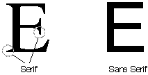
An example of the differences between an E serif and a sans-serif is courtesy of Opticentre.
Popular serif fonts include Times Roman, Courier, New Century Schoolbook, and Palatino.
Popular sans serif fonts include Helvetica, Verdana, Arial, and Geneva.
Technically serif and sans-serif are considered roman, however there is considerable disagreement with many claiming that sans-serif is not roman.
An additional controversy between serif and sans-serif is the readability. Conventional “wisdom” claims that the “tails” of serif fonts make it easier for a reader to follow. Others believe that the lack of tails on a sans-serif font makes it cleaner and more legible to read in a small size or on-screen. Both “sides” prefer sans-serif for headlines or captions.
In both cases, deciding if serif and/or sans-serif are roman and their readability is your choice.
Roman versus Italic/Oblique
You could say that roman is the opposite of italic.
Italic and oblique are slanted forms of a typeface. Many refer to oblique fonts as italic. There is, however, a difference. Italic applies to fonts where the letter forms are redesigned, not just slanted and usually appear in serif. Oblique letter forms are simply slanted and usually appear in sans-serif.
Formatting Tips is . . .
. . . all about the appearance of text: the use of italics, bolding, underscoring, capitalization, margins, abbreviations, how to address people, using text or figures to relate numbers, etc. This section will also covers typographic definitions, layout issues, and certain language concerns. And since Formatting Tips is in no way complete, and I’m sure there are issues I’ve not come across, I would appreciate suggestions and comments from anyone… What concerns have you come across?
If you found this post on “Roman, a Typeface” interesting, consider subscribing to KD Did It, if you’d like to track this post for future updates.
| Roman Typeface | |
| Typography | |
| Definition: The standard appearance of fonts, type, words, however you want to refer to it in which the lines of the letters are straight up and down, i.e., not italicized. | |
| roman: Hi, how ya doin’?
italics: Hi, how ya doin’? |
|
C’mon, get it out of your system, bitch, whine, moan . . . which words are your pet peeves? Also, please note that I try to be as accurate as I can, but mistakes happen or I miss something. Email me if you find errors, so I can fix them . . . and we’ll all benefit!
Satisfy your curiosity about other Formatting Tips by exploring its homepage or more generally explore the index of self-editing posts. You may also want to explore Book Layout & Formatting Ideas, Formatting Tips, Grammar Explanations, Linguistics, Publishing Tips, the Properly Punctuated, Word Confusions, Writing Ideas and Resources, and Working Your Website.
Resources for Roman, a Typeface
“Roman Type.” Wikipedia.com 2 May 2021. Web. 15 July 2021. <https://en.wikipedia.org/wiki/Roman_type>.
“What is Serif and Sans Serif Font?” Fonts FAQ. Opticentre. n.d. Web. 15 July 2021. <https://www.opticentre.net/FAQ/Fonts/What-is-serif-and-sans-serif-font/>.
Pinterest Photo Credits
Kathy’s own work.