

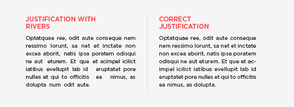
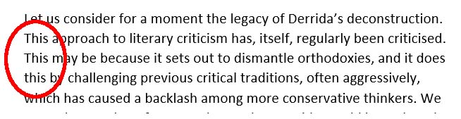
Rivers are those ugly paths of blank space that can occur in a text block and are both typographical and typesetting issues.
Typography is the art of arranging text so it’s visually appealing.
Typesetting involves arranging text so it adheres to grammatical rules. For example, typesetters have to figure out what to do if there’s a misplaced em-dash or a single word that carries over to a new line.
“A carefully composed text page appears as an orderly series of strips of black separated by horizontal channels of white space” (Dowding).
Rivers appear when the printed text page is not carefully composed, creating a vertical gap that affects the readers’ eyes, slows down reading comprehension, and makes it difficult for the eye to stay “on the line”.
It commonly occurs when incorrectly using justification, especially in narrow columns of text where the type size is relatively large.
Of course, this only applies to hard copy. Digital is another matter, and the best choice for digital is left justification instead of full — readers will insist on choosing their own font size, their own layout, and use devices with different screen sizes. Cheeky buggers *grin*.
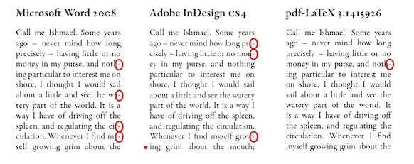
Part of the problem is a combination of the x-height of the typeface (whether the type appears broad or skinny), the values assigned to the widths of various characters, and the degree of control over character spacing and word spacing.

Broader typefaces are more prone to exhibit rivers, as are the less sophisticated typesetting applications that offer little control over spacing.
Increased sentence spacing can also exaggerate the river effect. More sophisticated typesetting applications divide individual characters into larger numbers, giving more numerical control. They also offer more comprehensive libraries of “kerning pairs” that tell the application how much space to allow between all possible combinations of letter pairs. (For more information, explore “Tracking and Kerning.)
Credit to: Dowding; Strizver; Felici
Exploring Later . . .
You may also want to explore more detail at “Orphans, Runts, and Widows“, “Tracking and Kerning“, and “Justification“. “Compound Words” can provide insight into hyphenating and “Publishing Software” can be useful in deciding if you could use desktop publishing software.
Book Layout & Formatting Ideas, a.k.a. . . .
. . . typesetting, is all about the how the inside of your fiction or non-fiction book — whether print or eBook — looks and the experience it provides your reader. Explore which pages are required or optional, the order the pages should follow, whether the page should be verso or recto, the definitions of technical terms, each page’s content, and in-depth formatting that includes text alignment, margins, bleeds, the choice of font and sizes, linespacing, how and where to place graphics of all sorts, how to style chapter headings, the need for a table of contents, the inclusion of epigraphs, running heads and feet, and so much more. Yes, book cover design will also be covered. Do check with the style guide for your publisher or in your field for how your layout may differ in page order and requirements, whether it’s page order or formatting. Make a checklist.
At the very least, knowing more about book layout design will help you understand a book layout designer you may hire.
My research has evolved into a sharing of information with y’all. I’m hoping you’ll share with us any questions you’ve had on this subject that have been a bête noire for you from either end. If you found this post on “Typographical Rivers” interesting, consider subscribing to KD Did It, if you’d like to track this post for future updates.
| Typographical Rivers | ||||||||
| Part of Book Layout: Typography; Layout; Typesetting | ||||||||
| Definition: A vertical white path caused by a gap of at least three lines which appear to run through a paragraph of text.
It’s a coincidental alignment of spaces caused by words that are too-widely spaced, monospaced fonts, full-text justification, or close repetition of a long word or similar words at regular intervals. A.k.a. rivers of white, text river |
||||||||
| Identify Rivers | ||||||||
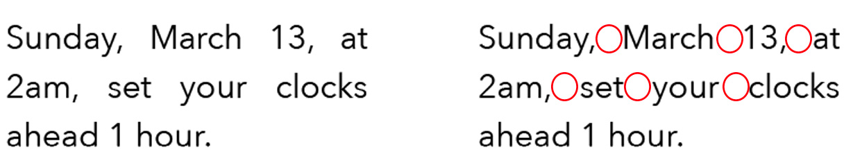
| Bubbles | Definition: Individual, obvious white space between words is called a bubble. | |||||||
|
Return to top or post contents |
 — |
|||||||
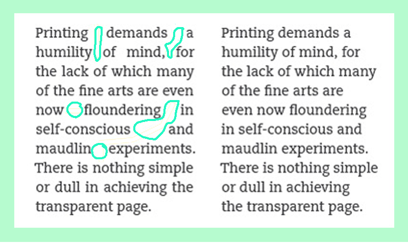
| Lakes and Holes | Definition: A cluster of adjacent or intertwined rivers that create a lighter area within a block of type. | |||||||
|
Return to top or post contents |
 — |
|||||||
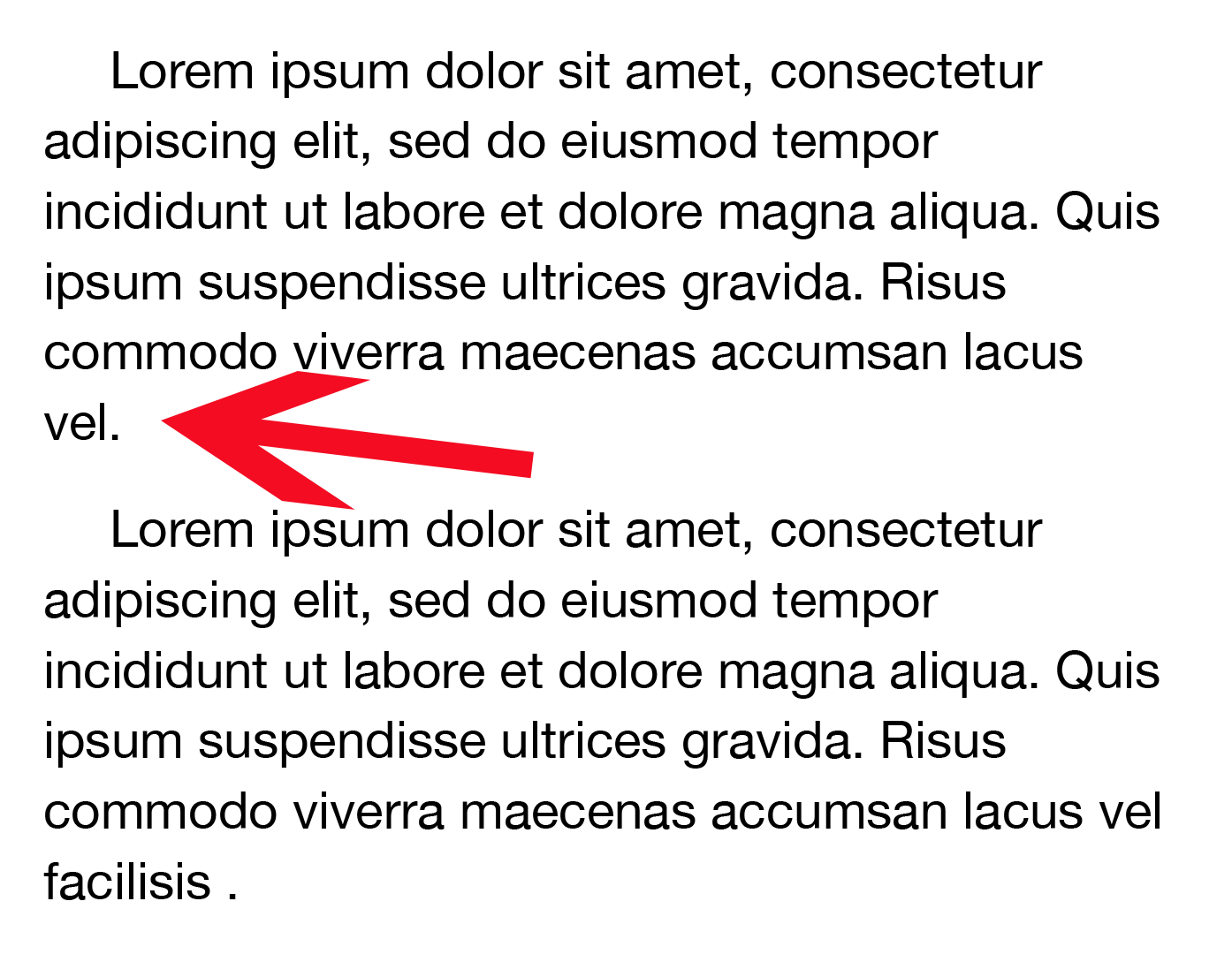
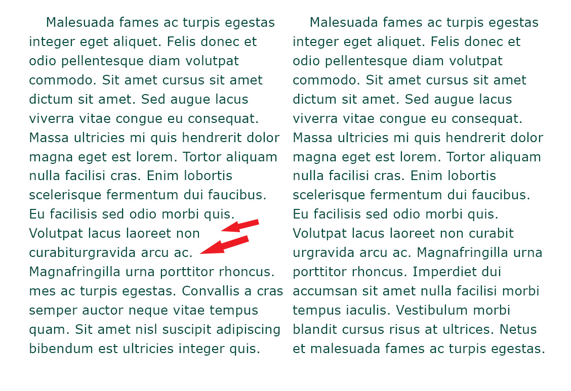
| Short Lines | Definition: Short lines can consist of a single short word, two or more short words, or the final fragment of a url that is breaking over a line.
The text of the last line of a paragraph should run longer than the indent of the following paragraph. Explore this more in “Orphans, Rags, Runts, and Widows“. |
|||||||
|
Return to top or post contents |
 — |
|||||||
| Stacks & Ladders | Definition: Letters, words, or punctuation appearing directly above/below one another.
Credit to: Stacks |
|||||||
|
Return to top or post contents |
 — |
|||||||
 — |
||||||||
| Fixes include: | ||||||||
| Rewrite the text to eliminate repetitiveness and reduce the amount of raggedness.
Use a soft return to adjust the end of a line. |
||||||||
| When Proofing, Watch Out For . . . | ||||||||
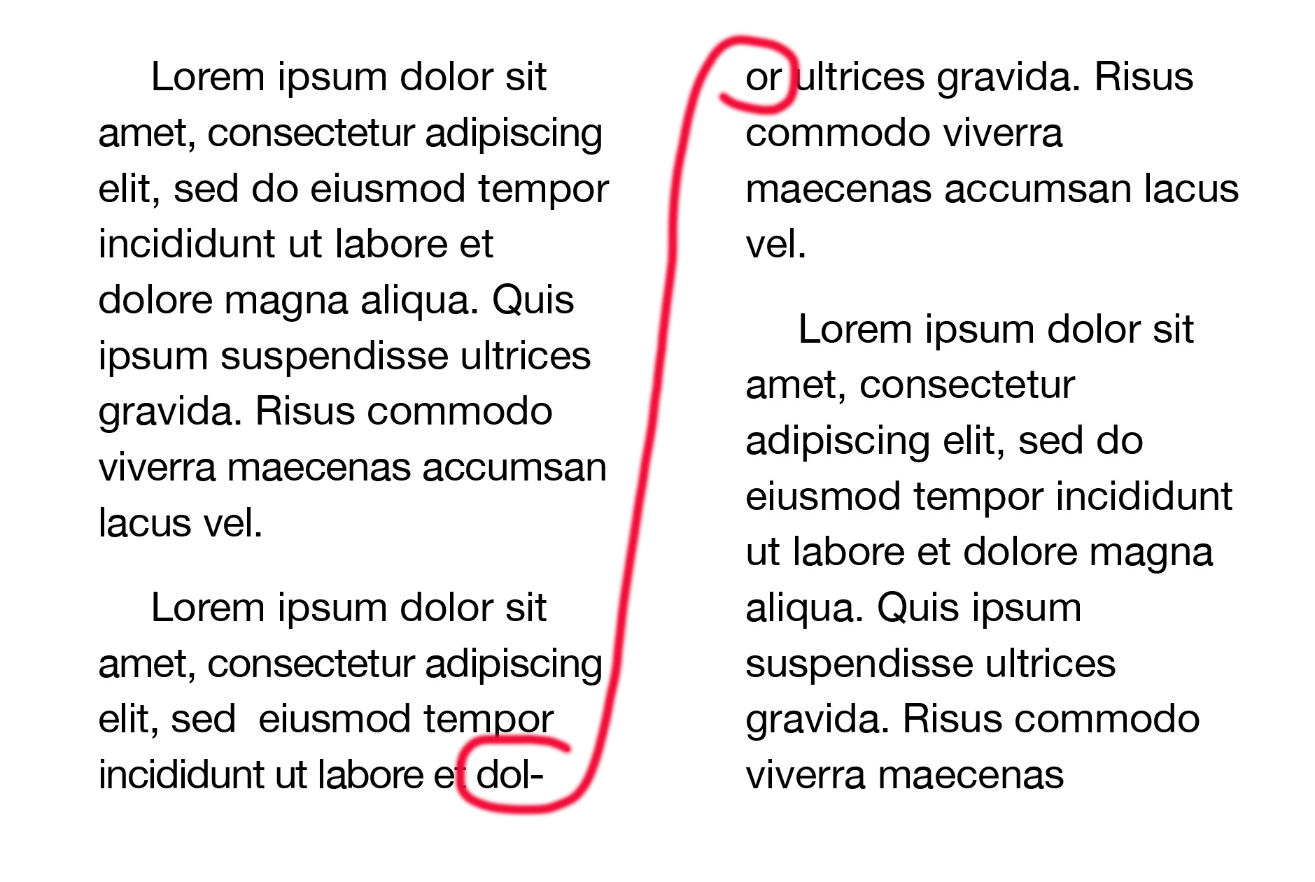
| Test for Rivers | Test for rivers by turning a proof sheet upside down (top to bottom) to examine the text. From this perspective, the eye is less likely to recognize words and the type can be viewed more readily as an overall pattern (Dowding). | |||||||
|
Return to top or post contents |
Rule: Avoid these rivers by increasing or decreasing the letter spacing between the words. | |||||||
| Manually adjust spacing: If using a PC, manually increase or decrease the letter spacing between words with CTRL + ALT + a backslash or backspace.
If using a Mac, you can adjust the character spacing in one word or over your chosen text by clicking Format > Style > Gear > Character Spacing. If working in Microsoft Word or PowerPoint, know that they don’t have great ways to manipulate spacing. You’re better off:
With Software: Use a layout program like InDesign, QuarkXPress, etc. Wikipedia has a list of desktop publishing software for Mac and Windows. You may also want to explore “Publishing Software“. |
||||||||
 — |
||||||||
| Word Break | Rule: No word may break across any page. | |||||||
|
Return to top or post contents |
 — |
|||||||
| Hyphenated Words | In typesetting terms, hyphenated words are “broken”, hyphenated, at the end of the line, e.g., hyphen-ated. | |||||||
|
Return to top or post contents |
Full justification creates a column of text that fills the entire line with even left and right margins.
Hyphens will be essential with full justification, particularly in narrow columns in print. However, hyphens can reduce readability, in particular if there are many consecutive hyphens (stacked). Ragged right creates a column of text that creates a straight edge on the left margin but does not create a straight edge on the right. Hyphenation can create better looking, tighter rags in non-aligned margins, as well as to help achieve more even letter spacing in justified text by having more control over rags, making for a more pleasing appearance. Both justification options create typesetting issues.
Desktop publishing and typesetting software can do a lot, but it is still up to the user to determine if, when, and how much to hyphenate, and to set the software preferences to behave accordingly. Guidelines do differ between print and digital media. Credit to: Strizver |
|||||||
 — |
||||||||
| Rule: Words that are already hyphenated, such as compound words, compound numbers, prefixes, proper nouns, adjectives, etc., should only break directly after the existing hyphen. | ||||||||
|
||||||||
| Hanging Punctuation | Definition: Punctuation or letters at the start and end of lines that appear to indent into the text, creating the appearance of a ragged edge. “The punctuation then appears to ‘hang’ in the margin of the text” (Strizver). | |||||||
|
Return to top or post contents |
The culprits are mostly quotation marks, hyphens and dashes, periods, commas, asterisks, and any other character that does not have a lot of vertical mass, such as Ts.
To fix it, extend the margin for those lines using optical margin alignment. A.k.a. hung punc, hung punctuation |
|||||||
 — |
||||||||
| Fixes include: | ||||||||
| Manually Edit | Rule: Edit the words to remove (or add) as needed to adjust the raggedness.
Choose alternatives to repetitive words. Use a soft return to adjust the end of a line. |
|||||||
|
Return to top or post contents |
|
|||||||
| Rule: Manually insert a hyphen. | ||||||||
|
||||||||
| Adjust the “H&J” Settings | Definition: Known as the hyphenation and justification settings (for print), they can be found in most high end creative design suites, such as Adobe InDesign and Illustrator.
Note: H&J settings will vary from one program to the next. |
|||||||
|
Return to top or post contents |
Rule (sort of): The default settings for most H&J settings allow a two-letter hyphenation at the end of a line and anywhere from three to unlimited consecutive hyphenations in a row on the right margin.
A better choice of setting(s) are:
It is good practice to deselect:
Per Strizver, the “better choice” and deselection “can result in some unattractive and undesirable word breaks if left selected”. |
|||||||
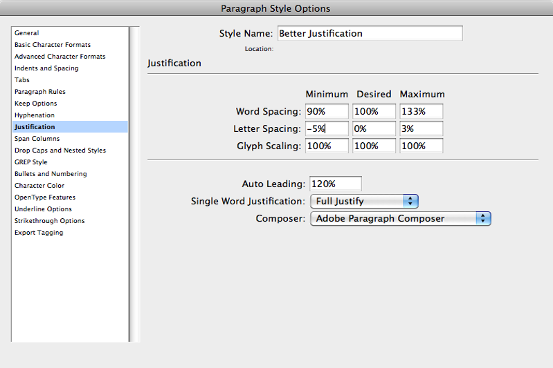
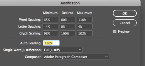
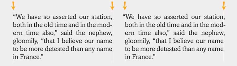
| Rule: Adjust the word spacing, letter spacing, and auto leading to avoid rivers via this example from InDesign. | ||||||||
 |
||||||||
Avoid rivers by:
|
||||||||
 |
||||||||
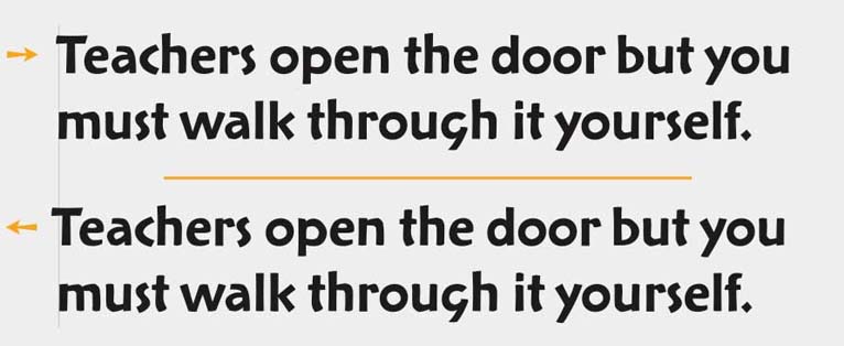
| Rule: Tweaking the tracking, making text looser or tighter.
This should be a last resort, as it’s better if you work with your text, edit the sentences to eliminate the widows and orphans before you start mucking about with tracking. I can’t emphasize enough that tracking can mess with the formatting of your document, reduce or increase the number of pages which can throw off indexing, the location of any images, and more. Do NOT use tracking to force your text to fit. It’s purpose is to make the text easier to read. Read more about tracking (and kerning) in the post “Tracking and Kerning“. |
||||||||
Fig. 16. The letters on top have been loosened up while those on the bottom have been pulled in. |
||||||||
| Use Optical Margin Alignment | Definition: Adjusts the punctuation on the left (and right) margin so the text block appears visually balanced.
Problem characters include quotation marks, hyphens and dashes, periods, commas, asterisks, and any other character that does not have a lot of vertical mass, such as Ts, Vs, Ws, etc. |
|||||||
| Adjusting hung punctuation is considered an advanced technique that was done with regularity by experienced typographers but should be easier with desktop publishing software.
Credit to: Strizver |
||||||||
 — |
||||||||
 — |
||||||||
C’mon, get it out of your system, bitch, whine, moan . . . which words are your pet peeves? Also, please note that I try to be as accurate as I can, but mistakes happen or I miss something. Email me if you find errors, so I can fix them . . . and we’ll all benefit!
Satisfy your curiosity about other Book Layout & Formatting by exploring its homepage or more generally explore the index of self-editing posts. You may also want to explore Formatting Tips, Grammar Explanations, Linguistics, Publishing Tips, the Properly Punctuated, Word Confusions, Writing Ideas and Resources, and Working Your Website.
Resources for Typographical Rivers
Some of these links may be affiliate links, and I will earn a small percentage, if you should buy it. It does not affect the price you pay.
“Documentation Typesetting Standards.” Scribe. n.d. Web. 3 Aug 2021. <https://scribenet.com/wfdw/docs/specifications/typeset-standards.html>.
Dowding, Geoffrey. Finer Points in the Spacing & Arrangement of Type.
Evenden, Ian. “Best Desktop Publishing Software 2021. TopTen Reviews. 4 Mar 2021. Web. 1 Aug 2021. <https://www.toptenreviews.com/best-desktop-publishing-software>.
Felici. James. The Complete Manual of Typography: A Guide to Setting Perfect Type. Berkeley: Peachpit Press, 2003. Ed 2. Adobe Press: 2011. <https://amzn.to/42YXpeh>. Print.
⸻. “On the Track of Good Type.” Design. Creative Pro. n.d. Web. 1 Apr 2023. <https://creativepro.com/track-good-type/>.
“Graphic Design Tip: Removing Rivers and Working with Justified Text.” Opus Design. n.d. Web. 14 June 2021. <https://opusdesign.us/wordcount/graphic-design-tip-removing-rivers-and-working-with-justified-text/>.
“River (Typography).” webiomirror. 11 Feb 2011. Web. 3 Aug 2021. <https://webiomirror.wordpress.com/2011/02/11/river-typography/>.
“River (Typography).” Wikipedia.com. 12 Feb 2021. Web. 14 June 2021. <https://en.wikipedia.org/wiki/River_(typography)>.
“Stacks and Ladders Explained.” Editing Tips. Knowadays. 18 Oct 2020. Web. 1 Apr 2023. <https://knowadays.com/blog/editing-tips-stacks-and-ladders-explained/>.
Stinson, Michael. “How to Set Justified Copy Without Rivers in Adobe InDesign.” 2 Dec 2019. Web. 3 Aug 2021. <https://www.youtube.com/watch?v=40nhT0O48uI>.
Strizver, Ilene. “Take Control of Your Hyphenation.” Creative Pro.com. n.d. Web. 21 Mar 2023. <https://creativepro.com/take-control-of-your-hyphenation/>.
Pinterest Photo Credits:
Typographic River by Jeff Dahl is under the CC BY-SA 4.0 license, via Wikimedia Commons. This W3C-unspecified vector image was created with Inkscape.
Revised as of 23 Apr 2024
By: Kathy Davie