Revised as of
14 May 2023
Justification is all about how the left and right margins of a text block align with the margin.
Full justification means your left and right margins are lined up evenly on both sides.
Left justification means only your left margin lines up evenly, which creates a “ragged right”.
Right justification means only your right margin lines up.
Centered is a type of justification, even though every line is centered, leaving both left and right ragged.
Exploring Later . . .
You may also want to explore more detail at “Orphans, Rags, Runts, and Widows“, “Tracking and Kerning“, and “Typographical Rivers“. “Compound Words” can provide insight into hyphenating and “Publishing Software” can be useful in deciding if you could use desktop publishing software.
Book Layout & Formatting Ideas, a.k.a. . . .
. . . typesetting, is all about the how the inside of your fiction or non-fiction book — whether print or eBook — looks and the experience it provides your reader. Explore which pages are required or optional, the order the pages should follow, whether the page should be verso or recto, the definitions of technical terms, each page’s content, and in-depth formatting that includes text alignment, margins, bleeds, the choice of font and sizes, linespacing, how and where to place graphics of all sorts, how to style chapter headings, the need for a table of contents, the inclusion of epigraphs, running heads and feet, and so much more. Yes, book cover design will also be covered. Do check with the style guide for your publisher or in your field for how your layout may differ in page order and requirements, whether it’s page order or formatting. Make a checklist.
At the very least, knowing more about book layout design will help you understand a book layout designer you may hire.
My research has evolved into a sharing of information with y’all. I’m hoping you’ll share with us any questions you’ve had on this subject that have been a bête noire for you from either end. If you found this post on “Justification” interesting, consider subscribing to KD Did It, if you’d like to track this post for future updates.
NOTE: Example pages provide a sample of what should be found on that page and/or an explanation of the text you’ll need to write for that page. It will be noted when the layout differs between a print and an eBook.
| Justification | ||||||||||
| Book Layout, Typesetting | ||||||||||
| Definition: The alignment of text relative to the left and/or right margins of a page, column, table cell, or tab. | ||||||||||
| Full-justification | Definition: Left and right margins line up evenly on both sides.
To accomplish this, the spaces between words and between glyphs or letters are stretched (loose lines) or compressed (tight lines). The last line of a paragraph is usually set for left justify as English is read from left to right. A.k.a. alignment, fully justified, justified, text alignment, text justification, type justification Credit to: Alred |
|||||||||
|
Return to top or post contents |
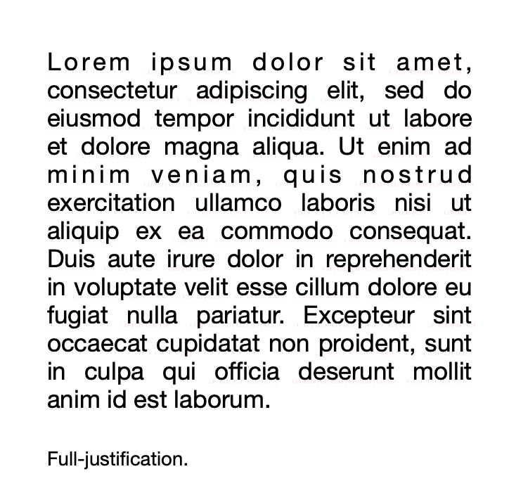
Fig. 1. An example of full justification, although there are some bubbles and rivers. |
|||||||||
| Useful for: | ||||||||||
Credit to: Alred |
||||||||||
| Problems with: | ||||||||||
|
||||||||||
| Style Guides Prefer: | ||||||||||
|
||||||||||
| Left Justification | Definition: Only your left margin lines up evenly, which creates a “ragged right“.
The default style on the Internet. A.k.a. flush left, left align, left-aligned, ragged right, ranged left Credit to: Alred |
|||||||||
|
Return to top or post contents |
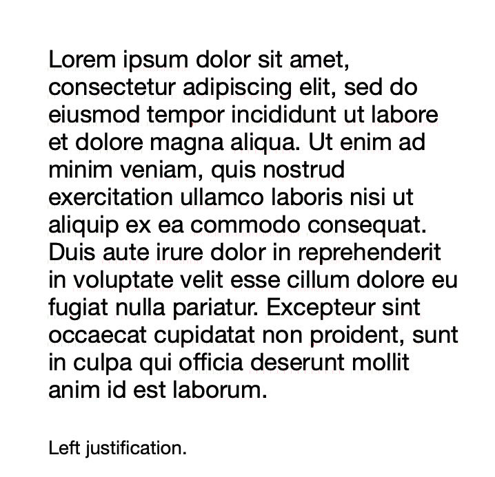
Fig. 2. A typical example of left justification. |
|||||||||
| Useful for: | ||||||||||
|
||||||||||
| Problems with: | ||||||||||
|
||||||||||
| Style Guides Prefer: | ||||||||||
|
||||||||||
| Ragged Right | Definition: It’s another name for left justification, except this example is all about an extreme ragged right that needs to be cleaned up.
“Clean up” by balancing the right edge to reduce the excess (see the possible fixes in the post on “Typographical Rivers”. |
|||||||||
|
Return to top or post contents |
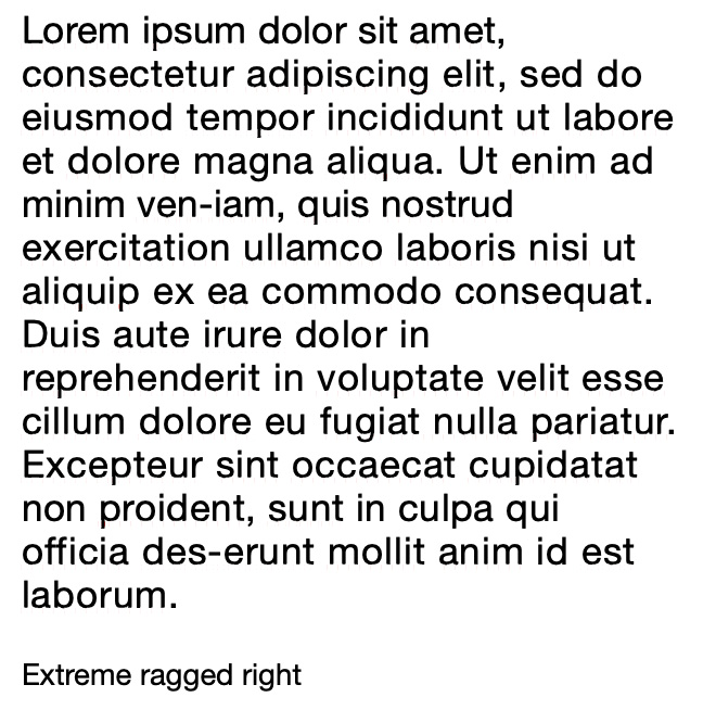
Fig. 3. This right margin needs more balance; it’s too extreme. |
|||||||||
| Right Justification | Definition: Only your right margin lines up, leaving a ragged left.
Standard justification in Arabic and Hebrew typography. A.k.a. flush right, right align, right-aligned, ragged left, ranged right |
|||||||||
|
Return to top or post contents |
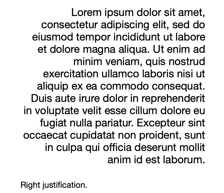
Fig. 4. An example of text that has been right justified. |
|||||||||
| Useful for: | ||||||||||
|
||||||||||
| Problems with: | ||||||||||
|
||||||||||
| Style Guides Prefer: | ||||||||||
|
||||||||||
| Centered | Definition: Every line is aligned to neither the left nor right margin; there is an even gap on each side of each line.
A.k.a. center-aligned, center justify |
|||||||||
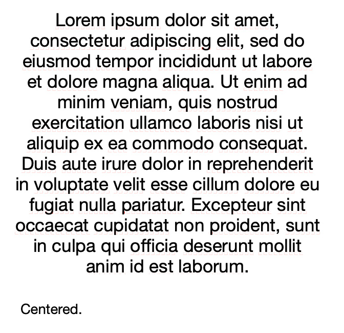
Fig. 5. While interesting as a shape, it is difficult to read centered text. |
||||||||||
| Useful for: | ||||||||||
Credit to: Typographic |
||||||||||
| Problems with: | ||||||||||
|
||||||||||
| Style Guides Prefer: | ||||||||||
|
||||||||||
Terminology
| Term | Definition |
|---|---|
| alignment | Returns each line of continuous text return to one side of the margin. |
| alley | The space between columns. |
| copy block | Treated as an independent element in the layout design, there is usually more than one line of text that is justified in its frame. |
| flush | Text that is aligned to a margin, frame, photo or other elements. |
| gutter | Empty space between facing pages of a book (inner margins).
Also see alley |
| loose line | Spaces between words, glyphs, or letters are stretched. |
| margin | The area between the main content of a page and the page edges, defining where a line of text begins and ends. |
| negative space | Extra white space around your text. |
| ragged | One side aligns with an edge. |
| tight line | Spaces between words, glyphs, or letters are compressed. |
C’mon, get it out of your system, bitch, whine, moan . . . which words are your pet peeves? Also, please note that I try to be as accurate as I can, but mistakes happen or I miss something. Email me if you find errors, so I can fix them . . . and we’ll all benefit!
Satisfy your curiosity about other Book Layout & Formatting Ideas by exploring its homepage or more generally explore the index of self-editing posts. You may also want to explore Formatting Tips, Grammar Explanations, Linguistics, Publishing Tips, the Properly Punctuated, Word Confusions, Writing Ideas and Resources, and Working Your Website.
Resources for Justification
Some of these links may be affiliate links, and I will earn a small percentage, if you should buy it. It does not affect the price you pay.
Alred, Gerald J., Charles T. Brusaw, and Walter E. Oliu. The Business Writer’s Handbook, Ed 12. Bedford/St. Martin’s: 2018. <https://amzn.to/3mkhxai>. Spiral-bound.
Chicago Manual of Style. Ed. 15. University of Chicago Press: 2003. <https://amzn.to/3JWIwSo>. The 17th edition is the most recent. <https://amzn.to/3JXugJ4>. Print.
Nordquist, Richard. “Justification (Typesetting and Composition).” ThoughtCo. 19 Jan 2020. Web. 8 Apr 2023. <https://www.thoughtco.com/justification-typesetting-and-composition-1691208>.
“Paragraph Alignment and Indentation.” APA Style. Last updated July 2022. Web. 10 Apr 2023. <https://apastyle.apa.org/style-grammar-guidelines/paper-format/paragraph-format>.
“Typographic Alignment.” Wikipedia. 10 Aug 2022. Web. 10 Apr 2023. <https://en.wikipedia.org/wiki/Typographic_alignment>.
Pinterest Photo Credits:
Please Sign In and Out Here by Alex Borland, via PublicDomainPictures.net, and Newspaper Article, via PeakPX, are both under the CC0 license. Messy Left Align is (WT-en) Cacahuate at English WikiVoyage is under the CC SA-1 license and Bhs Psalm 1 is under the CC BY-SA 3.0 license are both via Wikimedia Commons.


