I originally got curious about the differences between script, cursive, and fantasy fonts, and so “Font Terminology” evolved.
I figured y’all might be interested as well when it comes to choosing a font for your book or website and would want to understand the terms thrown at you.
I do plan on a couple of posts on the legalities of using fonts (and where to get your own) in your print and/or ebook as well as fonts for your website.
Font Categories
* All the above fonts are at the same size. |
Exploring Later . . .
You may be interested in exploring “Tracking and Kerning“, tittle in “Tilt vs Title vs Tittle“, “ Roman, a Typeface“, and “Inserting Diacritics“.
Book Layout & Formatting Ideas, a.k.a. . . .
. . . typesetting, is all about the how the inside of your fiction or non-fiction book — whether print or eBook — looks and the experience it provides your reader. Explore which pages are required or optional, the order the pages should follow, whether the page should be verso or recto, the definitions of technical terms, each page’s content, and in-depth formatting that includes text alignment, margins, bleeds, the choice of font and sizes, linespacing, how and where to place graphics of all sorts, how to style chapter headings, the need for a table of contents, the inclusion of epigraphs, running heads and feet, and so much more. Yes, book cover design will also be covered. Do check with the style guide for your publisher or in your field for how your layout may differ in page order and requirements, whether it’s page order or formatting. Make a checklist.
At the very least, knowing more about book layout design will help you understand a book layout designer you may hire.
My research has evolved into a sharing of information with y’all. I’m hoping you’ll share with us any questions you’ve had on this subject that have been a bête noire for you from either end. If you found this post on “Font Terminology” interesting, consider subscribing to KD Did It, if you’d like to track this post for future updates.
NOTE: Example pages provide a sample of what should be found on that page and/or an explanation of the text you’ll need to write for that page. It will be noted when the layout differs between a print and an eBook.
| Font Terminology | |||||||||||||||||
| Formatting | |||||||||||||||||
| Definition: In the old days of metal type and printing presses, typefaces and fonts were different critters. Today with computers, typeface and font are used interchangeably. | |||||||||||||||||
| Typeface | Definition: The specific design of the letters, symbols, glyphs, numbers, and punctuation marks. | ||||||||||||||||
|
Return to top or post contents |
|
||||||||||||||||
| Font | Definition: Refers to the particular size or style of a typeface.
The two most basic styles are sans-serif and serif. |
||||||||||||||||
|
Return to top or post contents |
Times New Roman 16pt bold
Helvetica 12pt italic Futura 24pt condensed medium |
||||||||||||||||
| Sans-serif | Definition: It literally means without line (commonly referred to as tail and has a darker appearance. | ||||||||||||||||
|
Return to top or post contents |
It’s considered a more “modern” style.
Helvetica, Arial, Verdana, Laro Soft, and Futura are some of the most popular. Sans-serif classifications include geometric, grotesque (and neo-grotesque), humanist, and blends of these previous ones. A.k.a. gothic, sans, sans serif |
||||||||||||||||
| Sans-serif | |||||||||||||||||
| Serif | Definition: A “tailed” style, serif letters have decorative lines extending from the body of the letter. | ||||||||||||||||
|
Return to top or post contents |
Serif is preferred for more formal writing and is considered to be a better choice for bodies of text, as the “tails” help distinguish letterforms and make it easier for the reader to follow. | ||||||||||||||||
| Serif | |||||||||||||||||
| Character | Definition: A single letter, number, or punctuation mark that is part of a font. | ||||||||||||||||
|
Return to top or post contents |
|
||||||||||||||||
| Uppercase | Definition: Capitalized letters in a typeface used at the start of a sentence, for proper nouns, and for acronyms. | ||||||||||||||||
|
Return to top or post contents |
A George FBI Æ Z Paris | ||||||||||||||||
| Lowercase | Definition: A smaller form of letter in a typeface used for most of the words in a sentence. | ||||||||||||||||
|
Return to top or post contents |
h dog pony stoplight i dishes books | ||||||||||||||||
| Small Cap | Definition: A letter(s) that is slightly larger than the lowercase letters in a typeface but still smaller than the uppercase letters. | ||||||||||||||||
|
Return to top or post contents |
With small caps, all characters in a given word or phrase will appear at the same height and size. | ||||||||||||||||
| the quick brown fox jumps over the lazy dog.
Mary, Mary, quite contrary, how does your garden grow? |
|||||||||||||||||
| Glyph | Definition: A visual representation in a specific shape, design, or representation of a character, such as a letter, word, number, punctuation mark, or a mark that tells you how to pronounce a letter. | ||||||||||||||||
|
Return to top or post contents |
|
||||||||||||||||
| Ligature | Definition: A pair of characters joined as a single glyph. | ||||||||||||||||
|
Return to top or post contents |
The purpose is to create a more legible design when two letters overlap and make them more attractive.
NOTE: Not all typefaces include ligatures. |
||||||||||||||||
|
|||||||||||||||||
| Font Size | Definition: How big or small the letters are. | ||||||||||||||||
|
Return to top or post contents |
10 point 18 point 24 point 48 point |
||||||||||||||||
| Terms Regarding Font Size | Definition: Typesetters use various terms regarding size — point was used above. Other measurement terms include:
|
||||||||||||||||
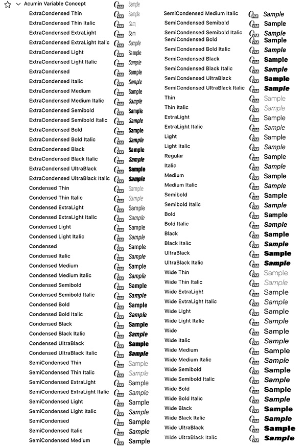
| Font-family | Definition: A typeface usually has variations of its design in different weights and styles. | ||||||||||||||||
|
Return to top or post contents |
Examples: | ||||||||||||||||
| Going beyond these four basics, font-families may also include:
Fig. 1. Acumin Variable Concept has a font-family with a huge range of variations. |
|||||||||||||||||
| Font Style | Definition: A variation in appearance of a font. | ||||||||||||||||
|
Return to top or post contents |
|
||||||||||||||||
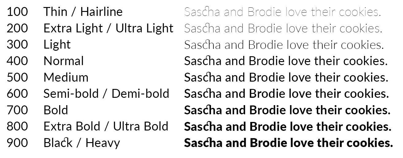
| Font Weight | Definition: The degree of boldness of a typeface — light, medium, bold, etc. | ||||||||||||||||
|
Return to top or post contents |
The most common weights are regular and bold but can be very light to very heavy values.
On a website, fonts can be given different thicknesses by using a range of numbers. |
||||||||||||||||

Fig. 2. Font Weights 100 to 900 |
|||||||||||||||||
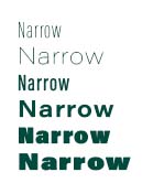
| Font Width | Definition: How much horizontal space is taken up by a typeface’s characters — a bold character/word takes up more width than a roman one. | ||||||||||||||||
|
Return to top or post contents |
Width can be useful for “headlines, branding, and short passages of text that need to stand out. The wide letters differentiate the text and draw the viewer’s attention” (Andre).
The different widths may be referred to as normal, condensed, extra condensed, narrow, wide, extended, ultraextended, and expanded. |
||||||||||||||||

Fig. 3. Six examples of Acumin Variable Concept typeface in different widths. |
|||||||||||||||||
| Typography Line Terms | Definition: Five guidelines to which characters are aligned. | ||||||||||||||||
|
Return to top or post contents |
|
||||||||||||||||

Fig. 4. Typography Line Terms is Max Naylor‘s work and is in the public domain, via Wikimedia Commons. |
|||||||||||||||||
| Font Formats | Definition: A specific file type(s) designated to hold font data, with a font itself being the manifestation of a typeface. | ||||||||||||||||
|
|||||||||||||||||
C’mon, get it out of your system, bitch, whine, moan . . . which words are your pet peeves? Also, please note that I try to be as accurate as I can, but mistakes happen or I miss something. Email me if you find errors, so I can fix them . . . and we’ll all benefit!
Satisfy your curiosity about other Book Layout & Formatting Ideas by exploring its homepage or more generally explore the index of self-editing posts. You may also want to explore Formatting Tips, Grammar Explanations, Linguistics, Publishing Tips, the Properly Punctuated, Word Confusions, Writing Ideas and Resources, and Working Your Website.
Resources for Font Terminology
“The A-Z of Typographic Terms.” Monotype Imaging Inc. n.d. Accessed 8 Nov 2023. <https://www.monotype.com/resources/z-typographic-terms>.
Andre, Marc. “33 Wide Fonts for Standout Text.” Vandelay Design. 7 Nov 2022. Accessed 8 Nov 2023. <https://www.vandelaydesign.com/wide-fonts/>.
“A Beautifully Illustrated Glossary of Typographic Terms You Should Know.” Canva. DATE. Accessed 29 Oct 2023. <https://www.canva.com/learn/typography-terms/>.
Fessenden, Therese. “Typography Terms Cheat Sheet.” NN/g Nielsen Norman Group. 26 May 2019. Accessed 29 Oct 2023. <https://www.nngroup.com/articles/typography-terms-ux/>.
Master Class. “Understanding Font Families: 5 Types of Font Families.” Master Class.com. 7 June 2021. Accessed 8 Nov 2023. <https://www.masterclass.com/articles/font-family-guide>.
MDN Contributors. “Font-weight.” GitLab. 7 July 2023. Accessed 7 Nov 2023. <https://developer.mozilla.org/en-US/docs/Web/CSS/@font-face/font-weight>.
Romano, Jenna. “20 Best Fonts for Your Website (And Tips on How to Choose).” Wix.com. 5 Oct 2023. Accessed 30 Oct 2023. <https://www.wix.com/blog/how-to-choose-best-fonts-website>.
“Sans-serif.” Wikipedia. 23 Oct 2023. Accessed 7 Nov 2023. <https://en.wikipedia.org/wiki/Sans-serif>.
Schenker, Marc. “20 Essential Typography Terms for Non-Designers.” Creative Market.com. 6 May 2021. Accessed 29 Oct 2023. <https://creativemarket.com/blog/typography-terms>.
Snell, Steven. “50+ Typography Terms: Glossary of Typographic Terms.” Vandelay Design. 17 Mar 2023. Accessed 8 Nov 2023. <https://www.vandelaydesign.com/typography-terms/>.
“Typographic Terms.” Adobe. n.d. Accessed 29 Oct 2023. <https://www.adobe.com/studio/print/pdf/typographic_terms.pdf>.
“Understanding Typography.” Material Design. n.d. Accessed 8 Nov 2023. <https://m2.material.io/design/typography/understanding-typography.html>.
“The Web Open Font Format (WOFF).” MDN Web Docs. Mozilla. n.d. Accessed 8 Nov 2023. <https://developer.mozilla.org/en-US/docs/Web/Guide/WOFF>.
Pinterest Photo Credits:
My own work.


