Revised as of
24 Mar 2024
Before we dive into navigation, it would be useful to know the parts of a webpage, so when a hero is mentioned, or a sidebar or footer, you’ll be able to visualize it.
A web page is a structured document and is usually one of many that comprise a website. A page always includes text and may include images, videos, and audio.
Any web page, whatever it’s offering, is written in HyperText Markup Language (HTML) and includes links to other resources — other locations on the same page, other pages within the website, and links to other websites.
Besides the HTML, there is usually a Cascading Style Sheet (CSS) that contains the instructions for how the web page looks and where content is placed on the page. The beauty of CSS is that you can make a change in the CSS file and it will apply to anything else on your website that uses the same coding.
A page may also include JavaScript or WebAssembly (Wasm) which enables dynamic behavior on the page. For example, it allows a user to fill out a form or have a slideshow, etc.
Luckily, with block editing and website builders, you won’t have to know much of this — although some knowledge will be needed.
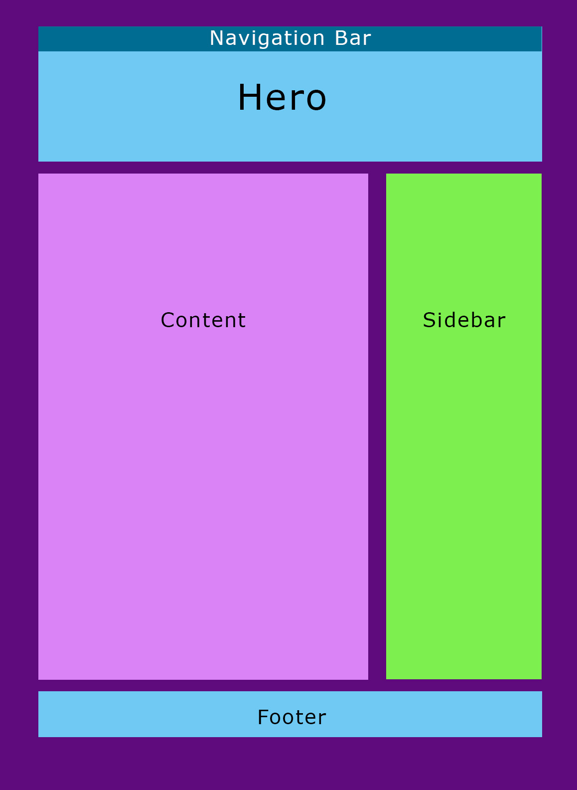
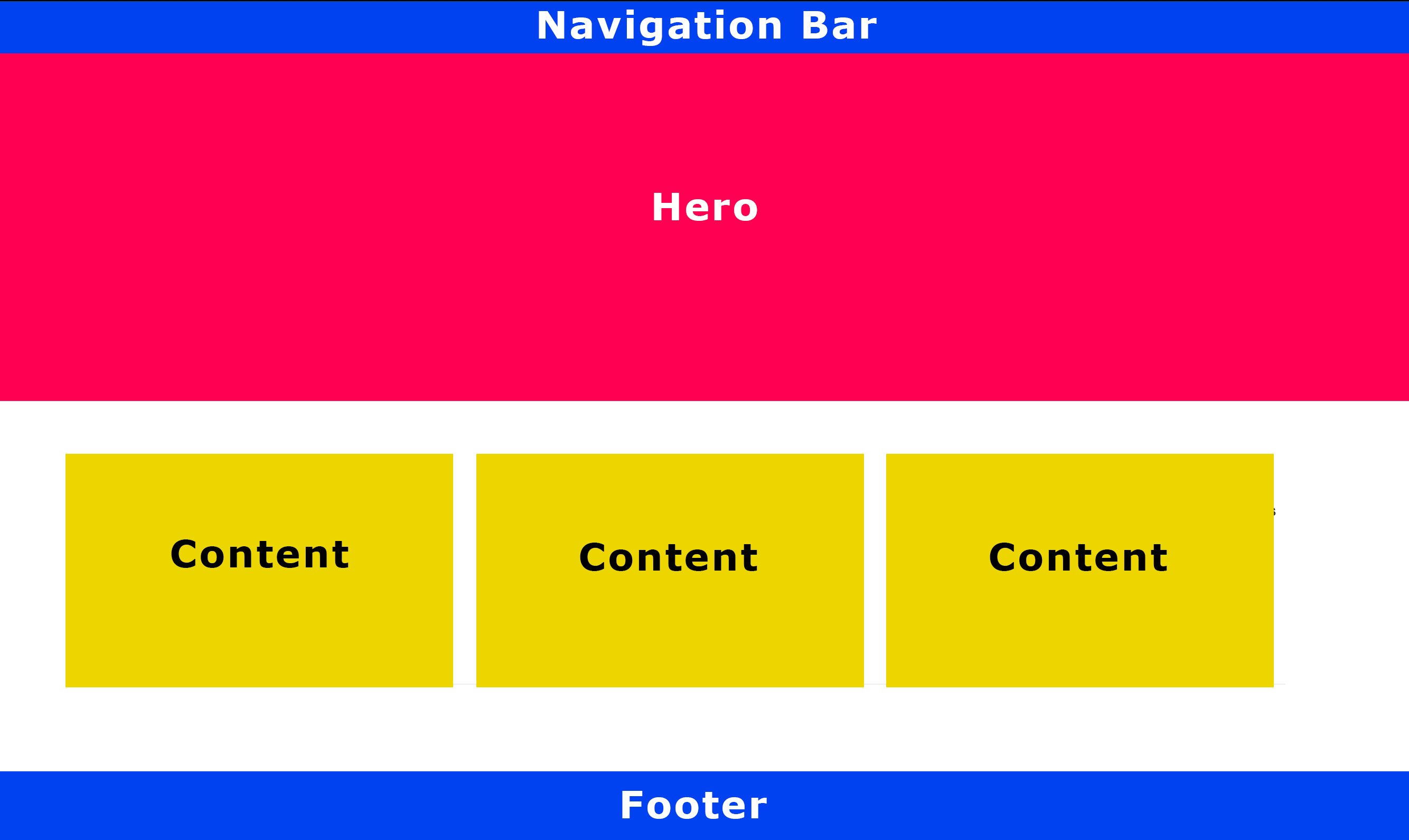
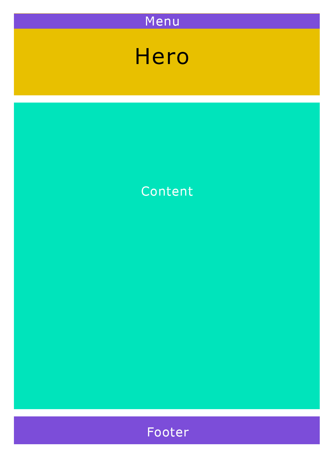
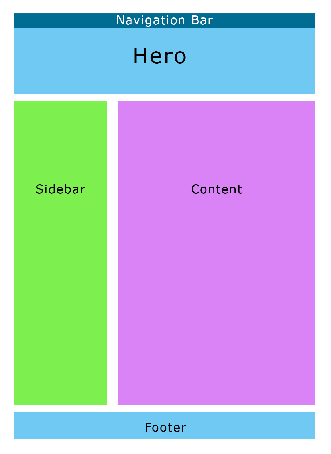
Check out these web page layouts . . .
Fig. 1. A slideshow with examples of some web page layouts.
Exploring More . . .
You may want to also look at more possibilities in “First Steps for a Website“, “Outline Your Website“, “Pages on the Front End of Your Website“, “Pages Behind the Scenes of Your Website“, “More Specific Disclosures for Your Website“, and “Navigation For Your Website“.
You may want to also look at more possibilities for fun on the homepage Building Your Author Website“.
Build Your Author Website is . . .
. . . an opportunity to do a bit more with your author’s website or blog and have some fun with it as well as getting a look at building it from the ground up with a comprehensive listing of the pages you’ll need . . . all while learning something about HTML (hypertext markup language) and CSS (cascading style sheets) — the easy way, lol.
If you found this post on “Anatomy of a Web Page” interesting, consider subscribing to KD Did It, if you’d like to track this post for future updates.
| Anatomy of a Web Page | |||
| Part of Web Building: Site Architecture | |||
| Definition: The basic building blocks that make up a web page. Naturally, there are all sorts of variations.
A.k.a. |
|||
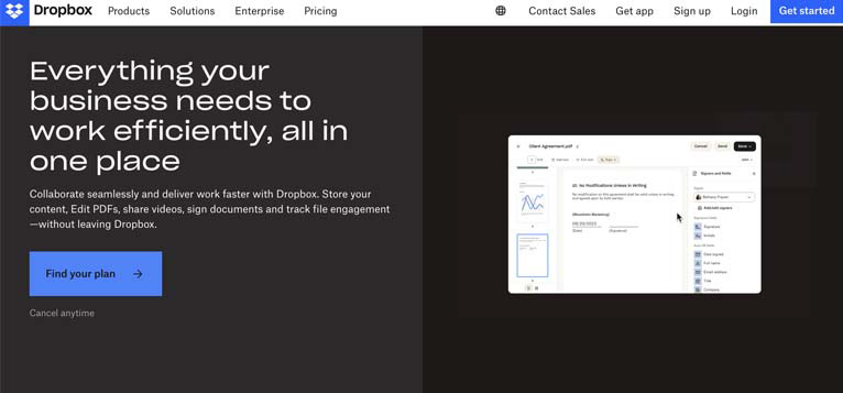
| Hero | Definition: A larger banner that is displayed at the top of the homepage — the first element that visitors will see above the fold.
A.k.a. banner image, header, header hero, hero image, hero section, hero shot, image banner |
||
|
Return to top or post contents |
It encompasses the header and sub-heading.
It is found ONLY on the primary homepage and typically features a photo, video, graphic, or illustration along with a statement or call-to-action to motivate users to visit another page on your site. Interactive heroes can also feature carousels, sliders, and other animations. It should convey everything visitors need to know about your brand — and avoid overloading new visitors with too much information right away. Size-wise, a full-screen hero image should be 1280 by 720px at an aspect ratio of 16:9 to ensure they won’t damage load time. You should also ensure they are hosted on a fast CDN (Content Delivery Network). A mobile-optimized images, should be 800 x 1,200px. Additional hero examples can be found at DreamHost. Source: Sears |
||
|
Fig. 2. Dropbox’s hero includes a header that tells you what you get as well as a banner on the right. |
|||
| Header | Definition: The website title and/or logo along with the navigation. | ||
|
Return to top or post contents |
“Most website layouts display the header on every page to let visitors navigate throughout the site.
Some website headers include other helpful elements, like search bars and buttons for especially important pages” (King). In WordPress, the header title is already set at <h1>. |
||
|
Fig. 3. Amazon’s header. |
|||
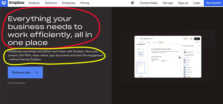
| Sub-heading | Definition: A follow-up line of text, usually eight to twelve words long, that expands on the main points that the header introduces, providing more context or information regarding the subject.
A.k.a. sub-headline, tagline Source: MasterClass |
||
|
Return to top or post contents |
Fig. 4. The header is circled in red while the sub-heading is circled in yellow. Other examples can be found at: |
||
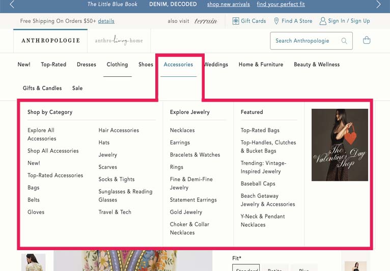
| Menu / Navigation | Definition: This is the menu, the navigation trail, the links your visitor uses to travel around your website. How they’ll find your products or services, how they’ll learn more about you, discover where you’re appearing for whatever reasons, find out how to contact you, everything. | ||
|
Return to top or post contents |
An upcoming post on Menus will go into details and explore menus such as classic, cascading, dropdown, mega, mobile, sidebar, sticky, etc. | ||
|
Fig. 5. Anthropolgie’s mega menu allows for an easier search. (It’s also an example of a drop-down menu.) |
|||
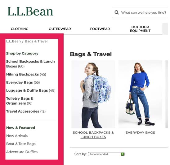
| Sidebar | Definition: Often websites will use a sidebar, or a narrow horizontal column, typically on the right (or left) side of the screen that contains more links or information that you believe your visitor would find important — it’s just not important enough to put in the main menu. | ||
|
Return to top or post contents |
Themes provided by website builders typically have a choice of one or two sidebars.
To use the sidebar, you’ll make use of a widget(s), a block that allows you to insert specific code for the information. And it’s really easy to move that block up or down in the sidebar.
Source: Weiner |
||
|
Fig. 6. L.L. Bean makes use of a left sidebar, indicated with a red outline. |
|||
| Web Content | Definition: All the information you want to give your visitors — text, images, video, and audio. | ||
|
Return to top or post contents |
Back in the day, you had to know HTML, then came CSS. Today, you can use a drag-and-drop website builder without knowing a lot of CSS or HTML.
A.k.a. body text, web copy Source: Brinker |
||
Some website builders include:
|
|||
| Headline | Definition: The concise line of text at the top of a post newspaper, or magazine article — think newspaper headline, the <h1>, that offers a summary of its contents. This is totally different from a header.
|
||
|
Return to top or post contents |
Use a key phrase in your heading for SEO purposes.
Be aware that a headline is shortened in searches on mobile devices, social media link previews, and the page’s tab label when you open it in your browser — ideally a headline should be no more than six words or about 70 characters, or you can change the title tag with your version of a shortened headline (many web hosts use your page’s H1 title as the title tag by default which cuts the headline short), you can customize this with a title tag. The method will depend on your website builder. A.k.a. h1 (in CSS/HTML), header, heading, hed (in shorthand) Source: MasterClass |
||
| <h1>Heading 1</h1> | |||
| Headings | Definition: Introduce a division or section of a subject or a class or category, summarize what this section or paragraph is about, break up the body of text, and allow readers to quickly scan the post to see what they’d be interested in. | ||
|
Return to top or post contents |
Hierarchy for headings is incredibly important for accessibility, navigation, and search engine optimization (SEO).
If using HTML coding, the hierarchy for a heading is:
There is NO 7th heading. You can only use one <h1> per page — it’s part of that hierarchy thing. It’ll be the product name, the book title, the name of a category, etc. |
||
Here’s what the structure of that post might look like:
The single H1 tag introduces the topic. H2 tags introduce sections. H3 tags introduce specific topics within the section. |
|||
| Paragraph | Definition: A distinct section of a piece of writing, usually dealing with a single theme and indicated by a new line, indentation, or numbering. | ||
|
Return to top or post contents |
|||
| Rule: A paragraph with no initial indentation. | |||
|
Writing a paragraph is simple enough. You start out with a topic and then expand on it with a few sentences. As soon as a new idea or point comes up, you start a new paragraph. In dialogue, each person gets a new paragraph, e.g., if John is talking and then Susie speaks… Susie gets a new paragraph. If John starts talking, yep, it’s a new paragraph. Of course, Paul might chime in . . . and he gets his own paragraph. |
|||
| Rule: A paragraph with an initial indentation. | |||
|
Writing a paragraph is simple enough. You start out with a topic and then expand on it with a few sentences. As soon as a new idea or point comes up, you start a new paragraph. In dialogue, each person gets a new paragraph, e.g., if John is talking and then Susie speaks… Susie gets a new paragraph. If John starts talking, yep, it’s a new paragraph. Of course, Paul might chime in . . . and he gets his own paragraph. |
|||
| Rule: A paragraph with a hanging indent. | |||
|
Writing a paragraph is simple enough. You start out with a topic and then expand on it with a few sentences. As soon as a new idea or point comes up, you start a new paragraph. In dialogue, each person gets a new paragraph, e.g., if John is talking and then Susie speaks… Susie gets a new paragraph. If John starts talking, yep, it’s a new paragraph. Of course, Paul might chime in . . . and he gets his own paragraph. |
|||
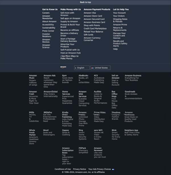
| Footer | Definition: Located at the bottom of any site (and all its pages) containing important information/links that would take up space in a hero. | ||
It may contain:
Have some fun with it and check out Fitzgerald‘s post for a plethora of examples. Source: Cavalier, Fitzgerald |
|||
|
Fig. 7. HubSpot has a simple footer. Fig. 8. Amazon’s footer is one big example of a footer. Fig. 9. The hotel Lorelei Sorrento has a great themed footer. |
|||
C’mon, get it out of your system, bitch, whine, moan . . . which website issues are your pet peeves? Also, please note that I try to be as accurate as I can, but mistakes happen or I miss something. Email me if you find errors, so I can fix the . . . and we’ll all benefit!
Satisfy your curiosity about other Working Your Website posts in its homepage or more generally explore the index of self-editing posts. You may also want to explore Formatting Tips, Grammar Explanations, Linguistics, Publishing Tips, the Properly Punctuated, Word Confusions, and Writing Ideas and Resources.
Resources for Parts of a Web Page
Resources for Parts of a Web Page
Some of these links may be affiliate links, and I will earn a small percentage, if you should buy it. It does not affect the price you pay.
Brinker, Mark. “WordPress Pages vs. Posts: Which To Use?.” MarkBrinker.com. 6 Feb 2024. Accessed 11 Feb 2024. <https://www.markbrinker.com/wordpress-pages-vs-posts>.
Fitzgerald, Anna. “Website Footers: Best Design Practices & 20 Top Examples.” HubSpot. 5 Jan 2024. Accessed 7 Feb 2024. <https://blog.hubspot.com/website/website-footer>.
“How to Use Headings on Your Site.” Yoast. 10 Oct 2023. Accessed 16 Jan 2024. <https://yoast.com/how-to-use-headings-on-your-site/>.
King, Melissa. “35 Parts of a Website: A Complete Guide for Beginners.” WordPress.com. 7 Dec 2022. Accessed 7 Feb 2024. <https://wordpress.com/go/website-building/parts-of-a-website/>.
MasterClass. “How to Write a Headline: 5 Tips for Writing a Good Hed.” MasterClass. 7 June 2021. Accessed 16 Jan 2024. <https://www.masterclass.com/articles/headline-explained#>.
Sears, Devin. “What is a CDN? How Does a CDN Work? Unlocking the Benefits + Top Alternatives.” Buehost.com. 12 Oct 2023. Accessed 15 Feb 2024. <https://www.bluehost.com/blog/what-is-a-cdn-benefits-alternatives/>.
Weiner, Amanda. “Essential Parts of a Website.” Website Essentials. WIXBlog. 21 Nov 2023. Accessed 15 Feb 2024. <https://www.wix.com/blog/parts-of-a-website>.
Pinterest Photo Credits
My own very simplistic work.


