Navigation consists of links that enable your visitors to move around in and between the different pages, posts, sections of a site, or off to other sites.
Navigational Elements
All navigation starts with the hyperlink and can be found in the main navigational menu and local navigation.
The Hyperlink, a.k.a. Link
The hyperlink, a.k.a. link, is THE tool. Clicking on a link can take your visitor anywhere on the page, to other pages on your site, to other sites on the Internet, to connect up with affiliate ads, to signify acceptance, and more.
With the <a href="xx">, code, you can create a link out of anything. The most common link is a text link. You can also link with images — many sites link their logo to the homepage.
There are two important menus for a website: the main navigation menu and the local navigation.
The Main Menu
The main menu is a series of linked items (those “buttons” at the top of a web page that take you to other pages on that site) and is usually divided into your most prominent categories — Home, Products, Services, Contact You, Blog, About. It will be on all of your pages!
It is the primary method of getting around on your site and should appear on every page with the same links (and submenus) — standard navigation menus can be found at the top (above the hero or just below it) or side of a website. Some of the more creative navigation menus are all over the place. It looks cool, but can be frustrating for a visitor to find their way around.
Depending upon the size of your site and/or the number of categories, you may need a menu that provides more options than a one- or two-word label, e.g., a dropdown is one of the most common.
Website themes usually come with default button styles, but you can change their appearance using CSS code.
This menu has also been referred to as global navigation, main navigation, navigation bar, and primary navigation.
Local Navigation
Local navigation is just as important and consists of links used to access lower levels in a structure, below the main navigation pages within a given category, and other options at the same level of a hierarchy, as well as the options below the current page.
It’s also been referred to as page-level navigation or sub-navigation.
How creative you get depends on your niche. Hey, if you write science fiction, you may want spaceships flying around to act as link backgrounds. Just keep in mind that viewers may be entranced by how cool it looks, but if they’re in a rush, they’ll go mad trying to find what they want.
Website Navigation Construction
Website navigation is CRUCIAL. Absolutely crucial. If you want people to see what you have to offer. Be clear. Be concise. Be user-friendly. Make using your navigation effortless. I gotta work on that.
Make use of that outline you created and:
- Keep it simple
- Use a simple and intuitive menu structure that is easy to understand and navigate — keep in mind expectations, where someone expects to find the Home button, a search bar, primary category buttons, etc.
- Avoid complex hierarchies and excessive menu items, as this can overwhelm users and make it difficult to find the desired content
- Be consistent:
- Put the same menu in the same place on every page — most users expect to find the main navigation at the top of the page
- The label should be user-friendly
- Use the same clear, concise labels every time
- Just like in your writing, be consistent in word usage and spelling
- Be sure that your link/button behaves the same way every time
- Use the same
active,hover, andvisitedbehaviors for these links
- Use the same
- Limit the number of buttons to seven at most
- Use the words and conventions that users expect to see, making it easier for them to get around on your site
- Include a search box
- Incorporate a clear hierarchy:
- Make use of visual cues — font weights, sizes, and colors (for both text and button background)
- This is a good time to incorporate accessibility guidelines — good color contrast, readable fonts, and include alternative text on your menu links as well
- Make use of visual cues — font weights, sizes, and colors (for both text and button background)
- Mobile optimization – With so many people accessing the Internet on mobile devices, you have to be sure that your menu adapts to the different screen sizes and touch-based input
- Contextual navigation – Include navigation options that are relevant to the current page or section of the website, such as related content suggestions, breadcrumbs, or quick links to frequently accessed pages
Keep an eye on how well your navigation is working using analytics and user testing. Pay attention to user feedback and monitor metrics such as click-through rates and bounce rates to identify areas for improvement.
For fun, pay attention to how other websites that are similar to yours are using menu design. Determine if their navigation would be effective for you. Keep an eye open for current trends and innovations in website navigation.
Source: Sernoff
NOTE: The next post will address hyperlinks in more detail.
Exploring More . . .
You may want to also look at more possibilities in “First Steps for a Website“, “Outline Your Website“, “Anatomy of a Web Page“, “Pages on the Front End of Your Website“, “Pages Behind the Scenes of Your Website“, and”More Specific Disclosures for Your Website“.
You may want to also look at more possibilities for fun on the homepage Building Your Author Website“.
Build Your Author Website is . . .
. . . an opportunity to do a bit more with your author’s website or blog and have some fun with it as well as getting a look at building it from the ground up with a comprehensive listing of the pages you’ll need . . . all while learning something about HTML (hypertext markup language) and CSS (cascading style sheets) — the easy way, lol.
If you found this post on “Navigation Menus For Your Website” interesting, consider subscribing to KD Did It, if you’d like to track this post for future updates.
| Website Navigation | |||
| Part of Web Building: Site Architecture | |||
| Definition: This is the menu, the navigation trail, the links your visitor uses to travel around your website. How they’ll find your products or services, how they’ll learn more about you, discover where you’re appearing for whatever reasons, find out how to contact you, everything.
A.k.a. menu, navigation bar Source: Fitzgerald |
|||
| Hyperlink, a.k.a. Link | Definition: A coded word, phrase, or object which “links” one page to another on the Internet. | ||
|
Return to top or post contents |
This link is typically activated by clicking on a highlighted word or image on the screen, moving the viewer from one website to another, one webpage to another, or moving through the same page.
A link is also referred to as a URL (yerl; sometimes pronounced earl, in which case use an before it). You can see a URL in your location bar, a.k.a. address bar, anytime you are on your browser. A.k.a. Uniform Resource Locator, URL |
||
|
Fig. 1. I was looking up permalinks on Wikipedia, as you can see by the URL in the location bar. |
|||
| Phrasing Navigation Options | |||
| Definition: Choosing the words for your main navigation links.
Your best choices will depend upon your brand. You may want to use a straight-forward approach or be more creative. What terms would they be likely to use? Keep search engine optimization in mind — use Google Analytics and Google’s Keywords tool to identify the search terms that most commonly bring people to your site. Then, you can use variations on those words as the guide for your website navigation. Source: Fitzgerald |
|||
|
Home | About | Contact | Services | Books |
|||
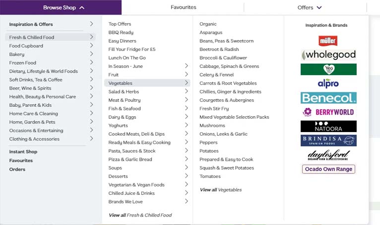
| Object-based Navigation | Definition: Uses noun-only categories. | ||
|
Return to top or post contents |
The most clear-cut option, as it operates like a table of contents, is grouping pages into the topics or categories that best fit. | ||
|
Fig. 2. You clearly know what you’re choosing with Nordstrom’s main menu of wearables — Women | Men | Kids | Designer, etc. Nordstrom’s does incorporate some action with “Sale”, “Stores”, “Purchases”, and “Explore”. |
|||
| Action-based Navigation | Definition: Uses action-oriented categories. | ||
|
Return to top or post contents |
Do visitors come to learn something, take a specific action, donate to a cause, visit, or . . .? | ||
|
Fig. 3. Visitors to Howard University plan to take action: applying to the school, visiting the school, or giving money to the school. |
|||
| Audience-based Navigation | Definition: The focus is on what is relevant to the users, presenting different features of the site to different target audiences. | ||
|
Return to top or post contents |
The most common sites using audience-based navigation are:
NOTE: Navigation by organizational structure has traditionally been less effective for web users and should be used as an alternative — not primary — form of navigation. |
||
|
Fig. 4. Goodreads includes: object (Home | My Books) action (Browse), and audience-based (Community) The last five graphics are links to Notifications | My Group Discussions | Messages | Friends | an image of me indicating it’s my account. This is a great way to include all these topics without taking up a lot of text real estate. |
|||
| Contextual Navigation | Definition: Links that are relevant to the current page or section of the website. | ||
|
Return to top or post contents |
Such links may transition to:
Place contextual navigation close to the content of the page, creating a strong connection between the meaning of a text and the linked related pages. There are two typical arrangements of contextual navigation:
A.k.a. associative links, related links |
||
| An example of a breadcrumb is at the top of this post.
The Source links in this post are examples of embedded navigation. Simple examples of related links are those at the bottom of this post that indicate an earlier published post and the sidebar widgets that link to several different topics including recent posts, cheap ➙ free books, and 2024 Reading Challenge. |
|||
| Menu Types | |||
| Definition: Depending on the screen size and the number of categories on your site, there are a range of menu choices for you. | |||
|
Return to top or post contents |
|||
| Classic Menu | Definition: The most commonly used menu system found in the website’s header, typically as a horizontal list with links. | ||
|
Return to top or post contents |
Fig. 5. Goodreads has a simple classic menu for the majority of its pages. Note that “Browse” and “Community” have upside down arrows indicating it has a dropdown. |
||
| Cascading Menu | Definition: A menu system that displays a submenu horizontally off to the side when selected. | ||
|
Return to top or post contents |
You’ve probably experienced a cascading menu on your desktop when you go looking for a file.
A great choice for websites with a lot of content but not a lot of screen space — users are only shown further choices relevant to their earlier selections. Although mobile screens do have screen limitations. A.k.a. fly-out menu |
||
|
Fig. 6. This is an old example of the cascading menu at Wholegood. |
|||
| Dropdown Menu | Definition: An expanding text menu system that allows a list of additional items to open up vertically when visitors click on — or hover over — one of the menu items. | ||
|
Return to top or post contents |
A great choice for websites with a lot of content but not a lot of screen space. Use a symbol, usually ▶ or ▼, to the right of the label text to indicate that there is a dropdown menu available.
Keep dropdown choices to two levels at most. If you need more, re-think your categories. A dropdown menu can be assigned one of two types of clicks to activate the menu:
A.k.a. drop down, drop-down |
||
| Play with a basic dropdown menu at W3Schools.
Other dropdown examples and posts include:
|
|||
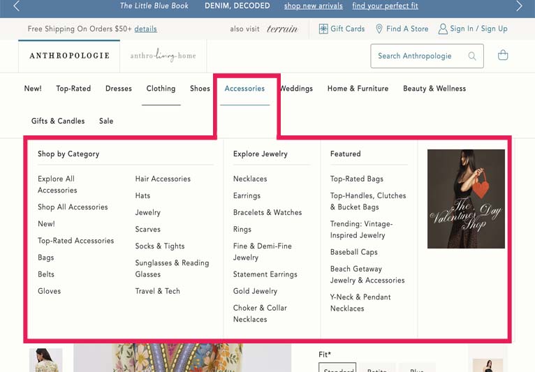
| Mega Menu | Definition: A multi-level drop-down menu that expands when your visitor hover over a link in the main navigation. The drop-down mega menu then shows you many links organized into categories and sub-categories, kind of like a sitemap. | ||
|
Return to top or post contents |
You’ll find mega menus on a complex site with tons of pages, such as e-commerce websites and blogs. They provide the information clearly without forcing a user to dig through a maze of inner pages.
Suggestions include:
Source: Forrest |
||
|
Fig. 7. Anthropolgie’s mega menu allows for an easier search. (It’s also an example of a drop-down menu.) You can find some great examples at: Eastern Standard has a great post on mega menus. WP Engine discusses a free WordPress plugin, Max Mega Menu, to install your own mega menu. |
|||
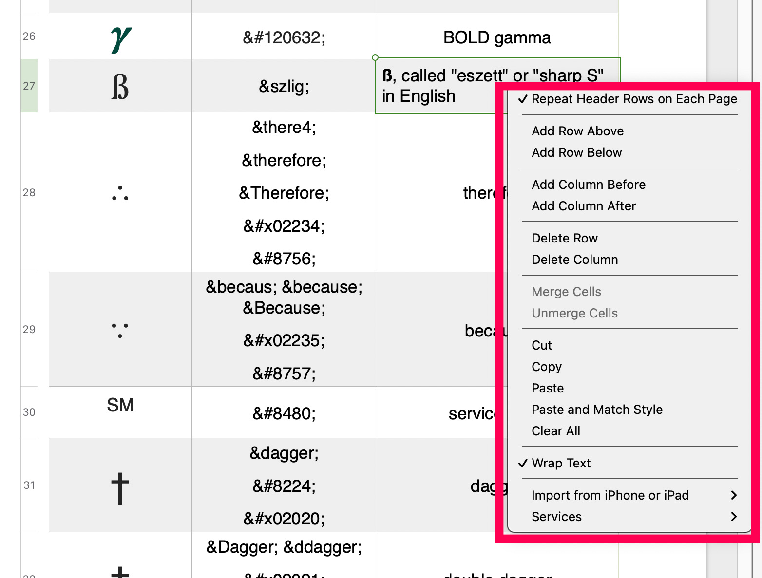
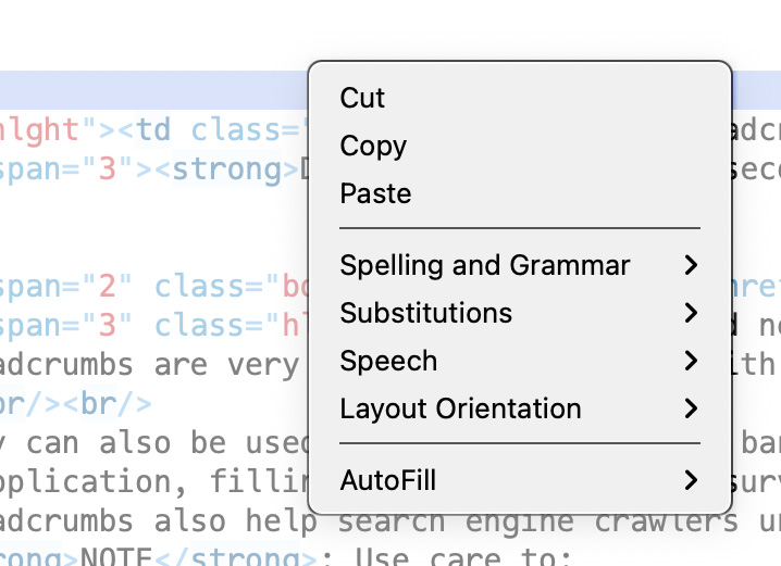
| Popover Menu | Definition: A list system that presents a set of options in a compact form and triggered by a button or icon. | ||
|
Return to top or post contents |
It is designed to be unobtrusive and contextually relevant to the user’s interaction. | ||
|
Fig. 8. This popover menu is produced by a right-click inside a table cell. |
|||
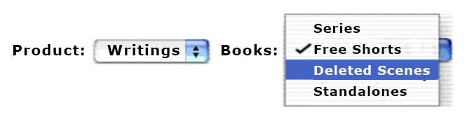
| Popup Button “Menu” | Definition: A generic term for a list system that opens up temporarily on top of the box, enabling interaction or providing information. | ||
|
Return to top or post contents |
A popup is part of a group known as “overlays“. Their purpose includes ads, notifications, alerts, or modal dialogs. A.k.a. pop up, pop-up Source: Suska |
||
|
Fig. 9. In a pop-up, the menu appears on top of the box; the checkmark indicates the previous choice made. |
|||
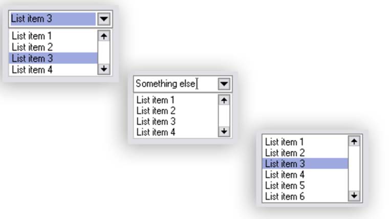
| Pull-down Menu | Definition: A menu system that is usually used to provide a list of choices — usually on an order form that provides a list of states or countries. | ||
|
Return to top or post contents |
A.k.a. combination box, combo box, drop-down combo box, drop-down list combo box, drop-down list, editable combo box, editable menulist, list, list box, list view, pop-up menu, simple combo box, uneditable combo box | ||
|
Fig. 10. A pull-down menu can be useful. |
|||
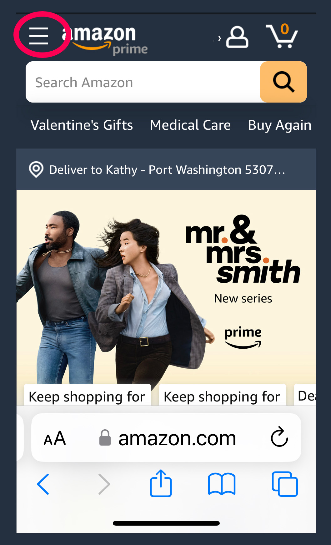
| Mobile Menu | Definition: A menu system that hides navigation links from the main page on a mobile device and is usually represented as an icon with three stacked lines, freeing up valuable screen real estate by only showing information that is relevant to the end user’s immediate activity. | ||
|
Return to top or post contents |
When a site is viewed on a mobile device, the navigation usually morphs into an icon: ☰, ⋮, or your logo
When it’s clicked on, it opens up into a menu. It originated in mobile navigation design, but is coming to be widely used on desktop (websites) as well, especially if there are too many pages you need to link to in your navigation bar. Placement is usually in the top left or top right of the computer screen or mobile device. Use responsive design principles to adapt the menu layout and interaction to different screen sizes and touch-based input. A.k.a. expandable menu, hamburger menu, menu icon, navigation drawer, slide drawer icon, slide drawer navigation Source: Ultimate, Traditional |
||
|
Fig. 11. The red circle notes this example of a hamburger menu. |
|||
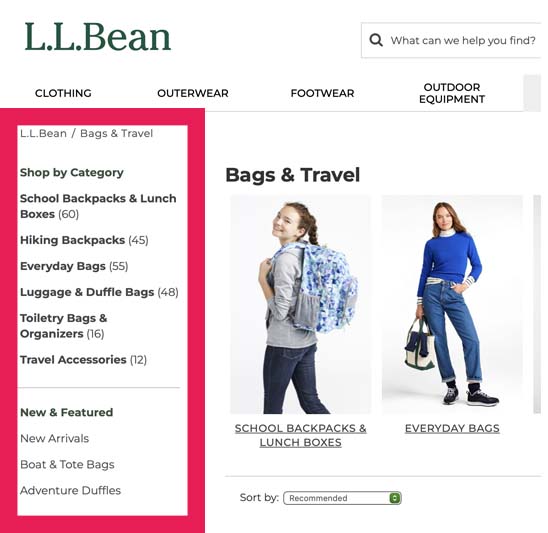
| Sidebar Menu | Definition: A menu system that lists supplementary information for users and is located on the left or right side of a webpage. | ||
|
Return to top or post contents |
This information can include:
Take visitors deeper into your site. Ideally, get visitors to subscribe or get them to buy/subscribe to something. Be eye-catching enough to get your visitor’s attention, but not so distracting that people forget to read your content. |
||
|
Fig. 12. LL Bean uses a left-sidebar menu. Play with the dropdown sidebar menu at W3Schools
|
|||
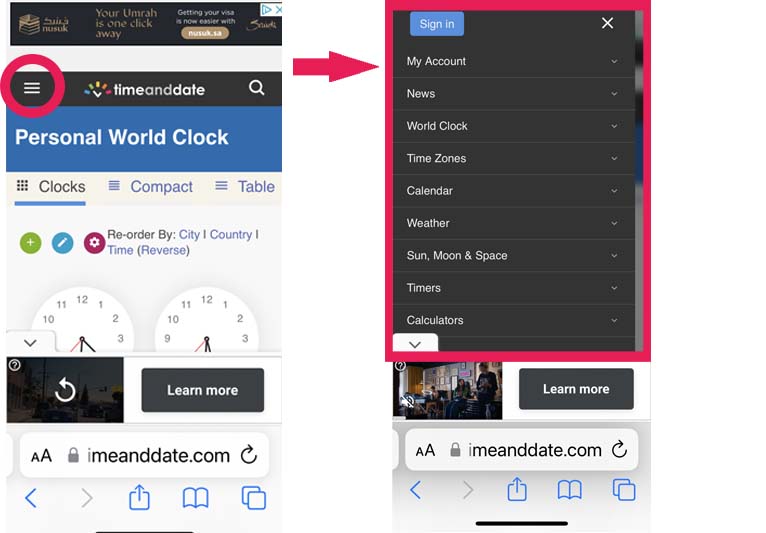
| Mobile Sidebar | For the most part, do not use a sidebar at all on a mobile device, instead consider:
|
||
|
Return to top or post contents |
Fig. 13. Time and Date uses a sliding menu. Click the “hamburger” and the menu appears. Play with the animated sidebar menu at W3Schools. Most of the websites you view on your cellphone or tablet have sidebar menus. Explore. |
||
| Sticky Menu | Definition: A menu system that stays put as visitors scroll down the site. | ||
|
Return to top or post contents |
These are ideal for long-scrolling pages, as it keeps the navigation bar at the top of the viewing window and visitors don’t have to scroll back to access those links.
Since you don’t want to take away from the main content, be sure to keep the sticky menu as small as possible — while still providing click-room for your visitor. A.k.a. fixed menu, floating menu, persistent navigation bar |
||
| Play with the example at W3Schools.
There are some interactive examples on:
|
|||
| Tear-off Menu | Definition: Allows direct access to often-used commands, eliminates having to go up to the tool bar, scrolling down, making a selection . . . instead a quick right-click and there are your choices. | ||
|
Return to top or post contents |
You can also move the detached menu on the screen, and it stays open until closed or reattached.
That tear-off menu enables you to work more efficiently — yeah, I’m mostly mentioning the tear-off, so you aren’t left wondering. Source: Tear-off |
||
|
Fig. 14. A tear-off menu is most common in apps. Other tear-off examples include the palettes in Adobe’s Photoshop, InDesign, and Illustrator; the color palettes in word processing programs, etc. |
|||
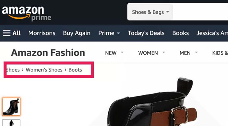
| Breadcrumbs | Definition: A secondary navigation word trail that essentially says “You are Here”. | ||
|
Return to top or post contents |
Breadcrumbs should never replace a primary navigation menu.
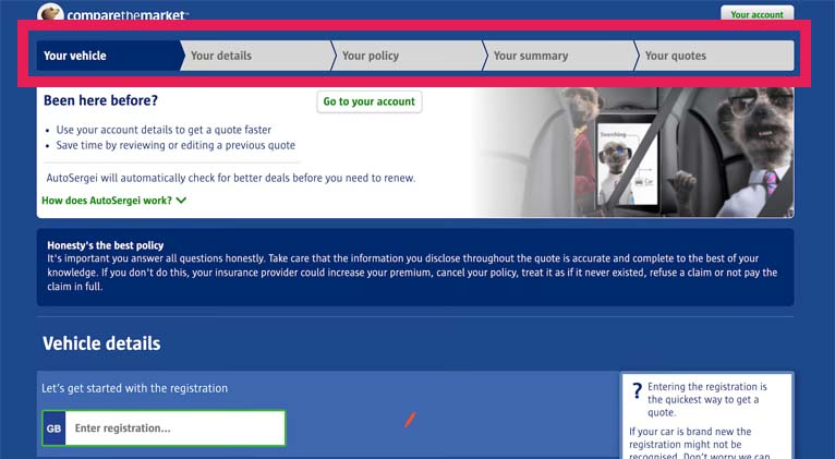
Breadcrumbs are very well-suited to sites with a complex hierarchy or a large number of pages — eCommerce sites! They can also be used as a type of progress bar to show visitors where they are in a process, such as a quiz, job application, filling out forms, taking a survey, etc. Breadcrumbs also help search engine crawlers understand how your site is structured — good SEO! NOTE: This is where your outline comes in handy, as you have already set up the hierarchy from the broadest category to the narrowest. The broadest category is you. The author. The artist. The plant care specialist. The website designer. Then you break it down to the broad categories of what you’re offering: books, services, specialist care for exotic plants, etc. Break this down into series, standalones, short stories, tour schedule, etc. You might break it down even further into single titles, individual posts, etc. Author Name > Books > Series > Title Artist > Wall Murals > Travel Scenes > Milan Kathy Davie > Author Resources > Word Confusions > “Their vs There vs They’re” Specialist > Services > Specific Service Use care to:
By linking through these breadcrumbs, your visitor can easily browse through the upper-level categories. Source: Davidov |
||
|
Fig. 15. The red outline points out the breadcrumb trail on Amazon’s page, as it progresses from the main category of shoes to women’s shoes and then specifically to boots (for women).
Fig. 16. Davidov provides an example of a progress bar in which the visitor wants to compare insurance costs. |
|||
| Site Map | Definition: Think of it as a table of contents page for your site. It lists and links to every page on your site. | ||
|
Return to top or post contents |
There are two types of sitemaps:
XML Sitemaps has a XML Sitemap Validator so you can check your sitemap for problems. Source: Thornsby |
||
| Custom 404 Page | Definition: Page Not Found, a.k.a. 404, is an HTTP status code that tells search engines that this page does not exist and to remove it from the XML index. | ||
|
If you browse on the Internet, you’ve encountered this page, which is automatically generated when the URL a visitor attempts to view doesn’t exist. I hate this page.
There are various reasons why a 404 comes up:
A generic “Page Not Found” is displayed automatically. You don’t need to do anything, however . . . This 404 can be bad news for you and your website, without options, the visitor leaves. To look at your site’s current 404 page, paste in a link to one of your posts or pages and remove a letter from the URL. You can have some fun by customizing your 404 page and include some useful options on what to do next:
To make changes on a WordPress.org template, explore WordPress.org‘s page on viewing/customizing your WordPress 404 page or check for a “custom 404” plugin. A.k.a. default landing page |
|||
|
Fig. 17. Backcountry’s 404
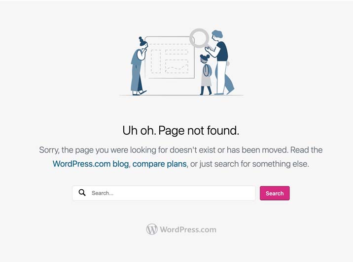
Fig. 18. WordPress.com’s 404 Other examples can be found at: Source: WordPress.com Team |
|||


C’mon, get it out of your system, bitch, whine, moan . . . which website issues are your pet peeves? Also, please note that I try to be as accurate as I can, but mistakes happen or I miss something. Email me if you find errors, so I can fix the . . . and we’ll all benefit!
Satisfy your curiosity about other Working Your Website posts in its homepage or more generally explore the index of self-editing posts. You may also want to explore Formatting Tips, Grammar Explanations, Linguistics, Publishing Tips, the Properly Punctuated, Word Confusions, and Writing Ideas and Resources.
Resources for Navigation Menus For Your Website
Some of these links may be affiliate links, and I will earn a small percentage, if you should buy it. It does not affect the price you pay.
“Creating an Error 404 Page.” WordPress.org. n.d. Accessed 7 Feb 2024. <https://codex.wordpress.org/Creating_an_Error_404_Page>.
Davidov, Sergei. “How to Use Breadcrumbs in Web Design to Improve Navigation.” Elementor. 7 June 2021. Accessed 11 Feb 2024. <https://elementor.com/blog/breadcrumbs-web-design/>.
Fitzgerald, Anna. “The Ultimate Guide [Types & Top Examples].” HubSpot. 27 Feb 2023. Accessed 8 Feb 2024. <https://blog.hubspot.com/website/main-website-navigation-ht>.
Forrest, Jason. “7 Examples of Creative Mega Menu Designs.” Insights. Website Design. Digital Ink. 8 Feb 2024. Accessed 7 Dec 2024. <https://www.digital.ink/blog/creative-mega-menus/>.
King, Melissa. “35 Parts of a Website: A Complete Guide for Beginners.” WordPress.com. 7 Dec 2022. Accessed 7 Feb 2024. <https://wordpress.com/go/website-building/parts-of-a-website/>.
Sernoff, Lena. “10 Outstanding Website Menus.” WIXBlog. 30 Nov 2023. Accessed 7 Feb 2024. <https://www.wix.com/blog/website-menus>.
Suska, Alicja. “Popups, Dialogs, Tooltips, and Popovers — UX Patterns #2.” Bootcamp. 15 July 2023. Accessed 8 Feb 2024. <https://bootcamp.uxdesign.cc/popups-dialogs-tooltips-and-popovers-ux-patterns-2-939da7a1ddcd>.
“Tear-off Menu.” Usability First. n.d. Accessed 8 Feb 2024. <https://www.usabilityfirst.com/glossary/tear-off-menu/index.html>.
“Tear-off Menu.” UXtweak. n.d. Accessed 17 Sept 2024. <https://www.uxtweak.com/ux-glossary/tear-off-menu/>.
Thornsby, Jessica. “How to Create a Custom 404 Page With WordPress and Elementor.” EnvatoTutsPlus. 13 Aug 2020. Accessed 8 Feb 2024. <https://webdesign.tutsplus.com/how-to-create-a-custom-404-page-with-wordpress-and-elementor–cms-35555t>.
“Traditional vs Hamburger Menus: Which is Right for Your Website?.” mailchimp. n.d. Accessed 10 Feb 2024. <https://mailchimp.com/resources/hamburger-menu/>.
“The Ultimate Guide to the Hamburger Menu and Its Alternatives.” UX Planet. 4 May 2018. Accessed 10 Feb 2024. <https://uxplanet.org/the-ultimate-guide-to-the-hamburger-menu-and-its-alternatives-e2da8dc7f1db>.
WordPress.com Team. “Create a Custom 404 Page.” WordPress.com. n.d. Accessed 8 Feb 2024. <https://wordpress.com/support/not-found/>.
Pinterest Photo Credits
The Corvette Galathea in a Storm in the North Sea, 1839, by C.W. Eckersberg is under the CC0 license, via RawRixel.