Writing your book is only the beginning of your bookselling journey. This next step, typesetting, involves delving into its design for the benefit of your readers.
Once your story is written, it needs to be formatted for a book — print and eBooks are laid out using different rules, even the genre of your book uses different rules! The content and protections for the front and back matter must be addressed. There are flexible “rules” about the number of pages OR the number of words in a genre or a targeted audience. There are costly legal rules about what fonts you can use, as well as formatting rules about your font styles.
There’s a bit that struck home:
“I wanted to advance it to the next round, but I couldn’t because the interior layout was so amateurish. It looked like a self-published book.”
Eeek!
Yep, your next question is probably the same as mine: What does that even mean?
“It means the person who formatted the interior did not adhere to book design standards. When done well, book layout usually goes unnoticed.”
Credit to: Wiberg
What it further means is . . . pay attention.
Discover which pages are required or optional, the order the pages should follow, whether the page should be verso or recto, the definitions of technical terms, each page’s content, and in-depth formatting that includes text alignment, margins, bleeds, the choice of font and sizes, linespacing, how and where to place graphics of all sorts, how to style chapter headings, the need for a table of contents, the inclusion of epigraphs, running heads and feet, and so much more.
Choices you make now will affect the cost of publishing and marketing your book, from the cover to the book description and/or summary, and which size you choose for your book.
Book Layout & Formatting Ideas is a result of my own research for my own purposes. I do so like to make something work more than one way, and I simply don’t see the purpose of my doing research and not sharing it. I’m also assuming that others are as confused as I am by everything involved in laying out a book and how to format it. There’s so much!
With luck, having a central location will be handy for anyone self-publishing their work. And just to make things easier to find, check out the index for any word that confuses you — at least that I’ve written a post on, anyway!
At the very least, knowing more about book layout design will help you understand a book layout designer you may hire.
Explore the current posts on those book layouts which confuse many authors. Explore it and enhance your own publications while saving time. For more detail on the “anatomy” of book layout and formatting ideas, see below
Book Layout & Formatting Ideas Posts:
Anatomy of a Book Layout & Formatting Ideas Post
Book Layout, etc., is similar to Formatting Tips and Grammar Explanations with its general definitions and general rules with a TOC of the post contents. It also uses a color hierarchy to organize sub-topics while noting style guide specifics, pertinent rules, and examples of how and why a layout should come together.
Resources for Book Layout & Formatting Ideas
Wiberg, Karin. “Self-Publishing? Avoid These Common Book Layout Mistakes.” ClearSight Books. 31 Oct 2019. Web. 27 Apr 2023. <https://clearsightbooks.com/common-book-layout-mistakes/>.
Pinterest Photo Credits:
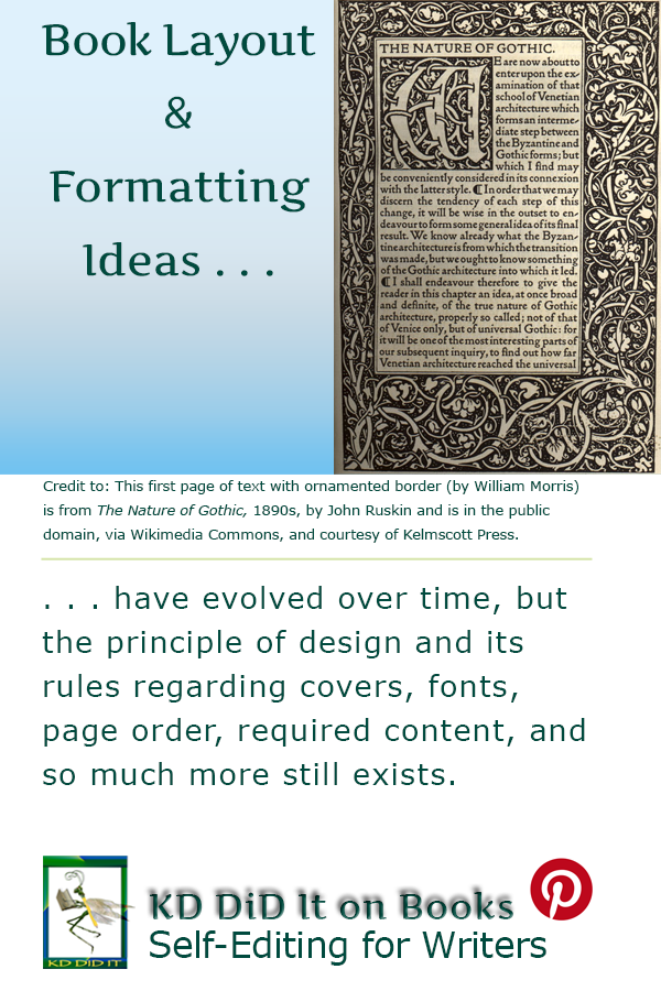
This first page of text with ornamented border (by William Morris) is from The Nature of Gothic, 1890s, by John Ruskin and is in the public domain, via Wikimedia Commons, and courtesy of Kelmscott Press.
Revised as of 29 Jan 2024
By: Kathy Davie


