There are a number of pitfalls in choosing a font for your book, depending on whether your book is a hard copy or an eBook. The biggest of course is if the font you want is legal for you to use! The smaller (and still important!) concerns involve the body text, chapter headings, figures, illustrations, tables, callouts, sidebars, and more.
Then there’s the question of what kind of glyphs, styles, weights, and more you’ll need.
It’s not that bad, lol. But it does point out what considerations you should keep in mind.
What Will You Use the Font For?
The use(s) required could determine which font style — serif or sans-serif — you should use? Note that a larger font-family offers more usage opportunities in weight, glyphs, and more.
What will the typeface/font be used for?
- The title, subtitle?
- Big blocks of text, captions, headings, tables, etc.?
- What languages (and their special characters) will your work be translated into?
- Promoting your book? Swag?
What’s the mood of your book? You’ll want to reinforce its message — IngramSparks notes that choosing a font that complements the message in your book helps reinforce your message:
- Set the mood:
- Formal or informal
- Contemporary or traditional
- Fun or serious
- Mood setters include:
- Baskerville – Good for literary fiction
- Sabon – Perfect for romanic fiction
- Garamond – Very popular with thrillers
- Caslon – Good for non-fiction works
- Utopia – Great for general interest books
Functionality
- Readability
- How versatile does the font need to be?
- Your text choices need to consider all the possibilities your work may have. Each font-family has different styles and weights with most including regular, italic, bold, and bold italic fonts.
- Will your characters need real italics, small caps, multiple numeral sets, different font weights, glyphs, or more?
- Should you choose a static or variable font?
- Will you want to convey different aspects of the story by changing the font to indicate:
- A shift in time periods
- A change in perspective or point of view
- The inclusion of letters, diary entries, or other unique documents within the narrative
- A person’s thoughts
- Language support
- What languages (and their special characters) will your work be translated into?
How many mediums will require it?
- Website, print book, eBook, products, swag, etc.
Readability
How readable your text is, is most important. After all, you do want readers to comfortably read the work you struggled over!
Keep in mind that the size you choose for print books is set in stone. Once it’s printed, the text will stay that size. With an eBook, the reader can choose what size they want to read.
Serif fonts are the industry standard for print books with 12-pt Times New Roman the default choice. Other serif fonts considered readable include Baskerville, Garamond, Georgia, Roboto, Rooney, PT Serif (PT Sans is a good sans-serif choice if pairing), etc., for the body text.
Good sans-serif fonts for reading include Arial, Calibri, Futura, Helvetica, Lato, Lucida Sans (PC) or Lucida Grande (Mac), Open Sans, Quicksand (good on mobile devices), Tahoma, Ubuntu, and Verdana.
E-reader Fonts
Like computers, all of the major eBook devices and tablets include a list of fonts that are installed by default on the device. These fonts are sometimes common ones like Times New Roman or Arial, but many times they can be fairly unique. These device fonts are intended to allow readers to customize the formatting of the text to their own liking, just like changing the font, font size, or margin widths.
The actual available fonts can depend on which model of eReader your reader is using . . . and whether the book is DRM-free or DRM‘d.
- In the Amazon Kindle, choices include Amazon Ember, Baskerville, Bookerly, Caecilia, Caecilia Condensed, Futura, Helvetica, OpenDyslexic, and Palatino.
- Barnes & Noble’s Nook (available fonts vary depending on the model) and can include Amasis, Ascender Sans, Caecilia, Century School Book, Dutch, Georgia, Gill Sans, Helvetica Neue, Light Classic, Malabar, Trebuchet, and Trebuchet MS.
- In Kobo’s eReaders (available fonts vary depending on the model), the fonts include AR UDJingxihei, Amasis, Avenir, Caecilia, Delima, Felbridge, Georgia, Gill Sans, Kobo Tsukushi Mincho, Kobo Nickel, OpenDyslexic, Pecita, Rakuten Sans, Rakuten Serif, Regista, and Rockwell.
- PocketBook includes DejaVu Serif, Droid Sans, Droid Serif, Georgia, Liberation Mono, Liberation Sans, Liberation Serif, Menuet Script, Myriad Pro, and Verdana.
- Sony includes Amasis, Frutiger Neue, Palatino Nova, Really No 2, Univers Next, and Verdana.
Know that these device-specific fonts are subject to change at any time (for example, Apple did this in December 2011, removing some fonts from iBooks and replacing them with others). Second, these fonts are different on every device, and there is no way to make the file look the same everywhere if you are relying on device-specific fonts.
There’s also the issue of the age of the eReader. Some eReaders may have problems switching to the device-specific fonts if you embed a font while older eReaders automatically revert to PMN Caecilia.
That said, using the device fonts is obviously the easiest option. And, there are times when you really, really want to use a specific font that “should” appear across any device. So you can embed the font you want to use as the primary font and then set up a fallback to the device-specific font. And hope for the best.
Font Sizes
Readers subconsciously view font-size in a hierarchical fashion. The bigger the font, the more important it must be.
Generally, a heading is from 14- to 16pt; subheadings are 12- to 14-pt; body text is ± 12-pt; footnotes are 9- to 10-pt (the current preference is the same size as your text); and, figures, illustrations, captions, credits, etc., can be 7.5- to 9-pt.
While the industry prefers a 12-pt font for body text, the real arbiter is your reader. (Keep in mind that readers can change the size in an eReader.)
Test a variety of choices out on some of your beta readers.
- Set a full paragraph in your chosen font and the size you want to use. Then copy that paragraph twice and set each one point size less and one point size more.
- Do the same thing with line length and line spacing.
Which one is the easiest to read? Which is the most comfortable for their eyes?
If you’re not happy with any of your test examples, start over with another font.
Wilson says that the best way to choose the size of your font is its x-height.
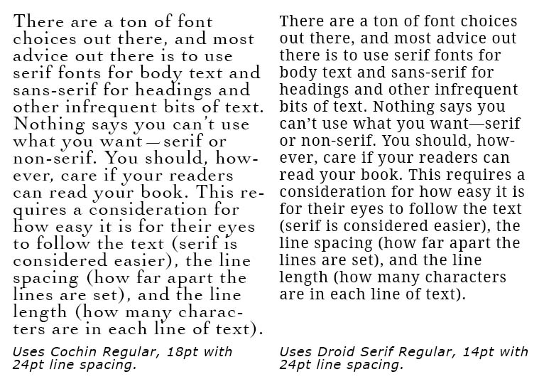
Fig. 2. A Comparison of Font X-heights.
Note the “font on the left has a small x-height while the font on the right has a large x-height”. And I think Wilson is right in saying that the taller x-height is an easier read.
Source: Wilson
Pairing
It’s best to choose two different fonts. One for the body text and numbers, tables, figures, etc., found in a book and another for headings, subheadings, etc. This means you’ll want to ensure that the two (or three) fonts pair well. That they look good together. Ideally their x-height will be similar. Do a Google search — try “font pairing with FontName”.
For example, if your serif body text is Times New Roman, it will pair well with Arial, Avenir, Druk, Gotham, Georgia, Goudy Trajan, Helios, Helvetica Neue, Neutra Display, and NY Irvin.
A sans-serif, Helvetica Neue pairs well with ITC Clearface, Lydian, and New Spirit.
Font Embedding
Embedding is all about including the font file(s) with the eBook or document. See the entry on static or variable fonts.
There are four kinds of embedding permissions:
- No embedding permissions means you cannot include the fonts in an eBook or document.
- Print and preview fonts can be embedded in an eBook, provided the user reading the eBook cannot edit the content of the eBook or document.
- Editable fonts can be embedded within content that can be edited by the user.
- Installable fonts within an eBook or document may be permanently installed by the user reading it.
Any of the last three embedding permissions above should be able to be used in the eBook files. However, please note that in many cases the license will additionally require that the eBook be encrypted with Digital Rights Management (DRM) of some kind to make the extraction and illegal use of the font file more difficult.
This can make selling your own eBooks on your website difficult, and may have other ramifications on your eBook sales efforts. It is always best to clarify the rights you have with the font licensor and ensure that you will not become legally liable for distributing the font just by putting it in your eBook files.
Remember, if you require bold, italicized, or some combination, you must embed those font files along with the regular style unless you’re using a variable font.
Adobe has a very useful page on Font Embedding Permissions, a very informative page on license rights for fonts purchased from them.
Cost Considerations
It’s not just the legalities, but the printing costs that are important — be choosy as to the particular font, as some fonts need more ink, which means the printing costs will go up.
Keep in mind that a bigger font will need more pages in a hardcopy book, which means the printing costs, again, will go up.
Legalities are also important.
Font Legalities
Only, ever, use a font that is legal for you to use. You do NOT want to be sued for using a font and have to destroy the whole lot . . . nor have to pay what could be a hefty fine.
Print Books
You’re safe here. Any font on your computer can be used for a print book or magazine, since the font never actually leaves your computer.
You can also use these fonts in electronic documents for viewing or printing existing content.
Ebooks
With an electronic book, the font is embedded within the story file — which means the font is saved with every single book, and you must have a license to use that font OR use an open source font.
Beware of “freeware” fonts as many of them are not actually free but illegal copies. Some will be legal but may restrict usage to non-commercial purposes, i.e., NOT your book. Be sure to confirm that the font you want will support the use(s) you need.
Did You Change the Font?
If you use a font to which you’ve made (allowed) changes:
- Follow the license terms when making changes to the font
- Include the original text of the license in OFL.txt
- “The OFL allows the licensed fonts to be used, studied, modified and redistributed freely as long as they are not sold by themselves. The fonts, including any derivative works, can be bundled, embedded, redistributed, and/or sold with any software provided that any reserved names are not used by derivative works” (OFL Text).
- Keep any copyright notices
- State changes in the original font (if any)
- Acknowledge the font author in your acknowledgements, the copyright page, or the colophon alongside the name of the font, possibly with a link to their website, but that is not required
Illegal Uses include . . .
You cannot use fonts that came with your computer for:
- Business purposes *
- Websites *
- Embedding the fonts within mobile or desktop applications
- Package or share the fonts with designers or print bureaus
- Designers and print bureaus must have their own license for the fonts
- Ebooks or any other electronic document
- Creating new document variations, templates, or dynamic content
- Any workflow which requires the user to move the font files themselves
There may be a limitation on the number of impressions or items you may produce. Adobe Fonts does not put a limitation on the number of impressions you may produce, but you can only use Adobe Fonts as long as you have a subscription to Adobe.
Buy the license from a well-known site to freely use your chosen font any time you’ll share it electronically and does not restrict the number of impressions.
Or, use a legally free font.
* Even though “everyone” does it. Check with one of the open source font sites for a legal font.
Free Fonts
You want an open source font, a.k.a. open license, — that means you can use the font any way you like without any licensing fee. Do NOT be fooled by a font that claims to be royalty free, it does not mean you’re free to use it any way you like.
Open licenses allow a font to be embedded inside the eBook files without any special permissions, and in some cases allow you to actually change the font’s design or abilities to make it better fit your needs. There are a few locations where you can usually find open license fonts, most notably Google Web Fonts.
Do be careful to ONLY use a reliable open source font company such as Google Fonts (the best of them), Fontesk (be sure to click the link to “free for commercial use”), Fontshare, Font Squirrel (read each individual font license to verify that it really is free to use), GNU FreeFont, and SIL Open Source.
If you absolutely have to use a font that does not have a clear license posted and is available only on free font websites — not available for purchase at any of the commercial font foundries — contact the font designer/creator of the font to ask for permission to use the font in your e-book (this will often be granted with an associated fee). Keep a copy of a receipt for payment and the licensing agreement, “Read Me” file, or correspondence with the font creator granting you permission to use the font in your publication.
Commercial Fonts
You gotta buy it. Make sure that the various styles you’ll need are included, that includes the basics: regular, bold, italic, numbers, and glyphs.
You may also want to be able to use it on a variety of mediums, including eBooks, hardcopy books, website, merchandising, etc. Also known as impressions, be sure there is no limit on how many times you can use the font.
Exploring Later . . .
You may also want to explore “Font Terminology“, “Tracking and Kerning“, “Typographical Rivers“, and “Roman, a Typeface“.
Book Layout & Formatting Ideas, a.k.a. . . .
. . . typesetting, is all about the how the inside of your fiction or non-fiction book — whether print or eBook — looks and the experience it provides your reader. Explore which pages are required or optional, the order the pages should follow, whether the page should be verso or recto, the definitions of technical terms, each page’s content, and in-depth formatting that includes text alignment, margins, bleeds, the choice of font and sizes, linespacing, how and where to place graphics of all sorts, how to style chapter headings, the need for a table of contents, the inclusion of epigraphs, running heads and feet, and so much more. Yes, book cover design will also be covered. Do check with the style guide for your publisher or in your field for how your layout may differ in page order and requirements, whether it’s page order or formatting. Make a checklist.
At the very least, knowing more about book layout design will help you understand a book layout designer you may hire.
My research has evolved into a sharing of information with y’all. I’m hoping you’ll share with us any questions you’ve had on this subject that have been a bête noire for you from either end. If you found this post on “Choosing Fonts for Your Book” interesting, consider subscribing to KD Did It, if you’d like to track this post for future updates.
| Fonts | ||||||||||||||||||||||||
| Definition: These days typeface and font are interchangeable with typeface the specific design of the letters, symbols, glyphs, numbers, and punctuation marks and fonts the particular size or style of a typeface.
The two most basic styles are sans-serif and serif. Other style choices include monospace, cursive, fantasy, and novelty (a subset of fantasy that can get really crazy). |
||||||||||||||||||||||||
| Font | Definition: The variation in weight and size of a typeface. | |||||||||||||||||||||||
Source: CSS Fonts |
||||||||||||||||||||||||
| Leading | Definition: The space between (above and below) adjacent lines of type.
A.k.a. line spacing, line-height (CSS) |
|||||||||||||||||||||||
|
Return to top or post contents |
Rule: Spacing should be somewhere from 1.1 to 1.5 (the ideal), depending on the font you choose.
You can also use a percentage — 120–145% of the point size — to determine spacing. In desktop publishing software *, you may want to increase the leading two to four extra points over the font size. |
|||||||||||||||||||||||
| Leading at 100%: Who knew that choosing and using a font for your book could be so fraught with possibilities? Leading at 175%: Leading at 200%: |
||||||||||||||||||||||||
| Line Length | Definition: The length of a line of text, usually measured in inches, points, or the number of characters per line (including punctuation and blank spaces). | |||||||||||||||||||||||
|
Return to top or post contents |
A line that is too short feels disconnected.
A line that is too long tends to make the reader search for the start of the next line. |
|||||||||||||||||||||||
| Rule: The average line length varies between 45 and 90 characters (including spaces). Some believe that the best average line length is between 50 and 75 characters.
Test your choices out on some readers! |
||||||||||||||||||||||||
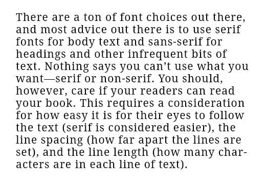
Fig. 3. 45-Character Line-length. |
||||||||||||||||||||||||
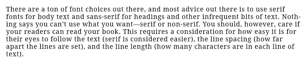
Fig. 4. 90-Character Line-length. |
||||||||||||||||||||||||
| Body Text | Definition: The main part of a printed text. | |||||||||||||||||||||||
|
Return to top or post contents |
The preference is for a serif font and includes Caslon, Garamond, Jenson, Minion, and Palatino, amongst many others. | |||||||||||||||||||||||
| Chapter Heading | Definition: The font used for the heading of your chapters. | |||||||||||||||||||||||
|
Return to top or post contents |
Ideally, use a minimum size of 14 points to a maximum of 16 points.
If you use a script, make sure it’s readable. IngramSpark states that as long as your heading is readable and reinforces your message, you can use whatever you like, as long as it is at least semi-bold — however . . . Script can be too decorative to be readable. IngramSpark and many other sites warn you to stay away from fonts that are a cliché, such as Comic Sans and Papyrus. A.k.a. “A” heading |
|||||||||||||||||||||||
| Subheading | Definition: The font used for the subheadings of your chapters. | |||||||||||||||||||||||
|
Return to top or post contents |
Ideally, use a minimum size of 12 points to a maximum of 14 points.
If you use a script, make sure it’s readable. A.k.a. “B” heading |
|||||||||||||||||||||||
| Call-out | Definition: A short string of text connected by a line, arrow, or similar graphic to a feature of an illustration or technical drawing, and giving information about that feature. | |||||||||||||||||||||||
|
Return to top or post contents |
It may also describe a short piece of text set in larger type than the rest of the page and intended to attract attention.
In documents that need to be translated often a neutral callout is used. By using numbers or letters as callout in combination with an image caption, translation is more efficient since the same graphic can be used in all languages. Use something different from the body; the font you choose for the figure titles would be good. A.k.a. callout Source: DeFilippo |
|||||||||||||||||||||||

Fig. 5. Callout Neo Office is under the CC BY-SA 3.0 license, via Wikimedia Commons and courtesy of NeoOffice. |
||||||||||||||||||||||||
| Sidebar | Definition: A short graphic or aside accompanying and providing more information than is in the text about a topic. | |||||||||||||||||||||||
|
Return to top or post contents |
Font-size ranges from the size of the body text to 1-2pts bigger and usually uses a complementary sans-serif font that is different from the body text.
A.k.a. boxout, call-out box, filler |
|||||||||||||||||||||||
Fig. 6. Sidebar. |
||||||||||||||||||||||||
| Source Credit | Definition: A caption that provides credit to the creator of the image, photograph, table, illustration, graph, chart, diagram, photo, drawing, or map, etc., and includes the title of the work, the name of the creator, the licensing information, and the website, book, etc., where it was found. | |||||||||||||||||||||||
|
Return to top or post contents |
Ideally, a crisp sans-serif with a high x-height — Arial or Helvetica are ideal — in an 8- to 10pt font size. | |||||||||||||||||||||||
|
TITLE by CREATOR is under the LICENSE, via SOURCE. Fig. 7. Credit Example by Kathy Davie. This is a template format and the “links” don’t actually connect to anything. They do serve as a reminder to “fill in the blanks”. This is merely an example of what I use. You can use your own format, provided you include this information. |
||||||||||||||||||||||||
| Figure | Definition: A figure is a graph, chart, diagram, photo, drawing, or map that is included in the book, article, document, etc., and is not a table. | |||||||||||||||||||||||
|
Return to top or post contents |
All figures require a caption including a description that clearly indicates what is being shown and use the same labeling conventions as for a source.
Commonly placed below the figure. Be consistent in placement throughout the book or document. Also be consistent in where you place the figure itself on the page: centered with no text flow around it or to the left or right with text flow. Check with your publisher to see if they have a style preference for placement. Be sure to include a figure list in the front matter. Also in consecutive order and independently numbered from tables. |
|||||||||||||||||||||||
| Rule: Labels, captions, etc., must begin with a figure number in the order in which they appear in the text. Use either Figure xx. or Fig. xx. Be CONSISTENT in the format you use. | ||||||||||||||||||||||||
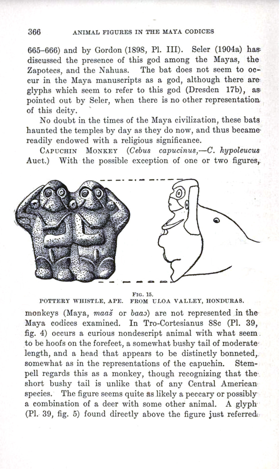
Fig. 8. Animal Figures in the Maya Codices, page 366, Fig. 15, BHL41003911, is under the Public Domain Mark 1.0 license, via Picryl and courtesy of the Maya Codices Collection and the Biodiversity Heritage Library. |
||||||||||||||||||||||||
| Illustration | Definition: An illustration is an artwork, animation, diagram, drawing, film clip, or photo.
Depending on context, use the same labeling conventions as for a source. |
|||||||||||||||||||||||
| Table | Definition: A set of facts or figures systematically displayed in columns and rows. | |||||||||||||||||||||||
|
Return to top or post contents |
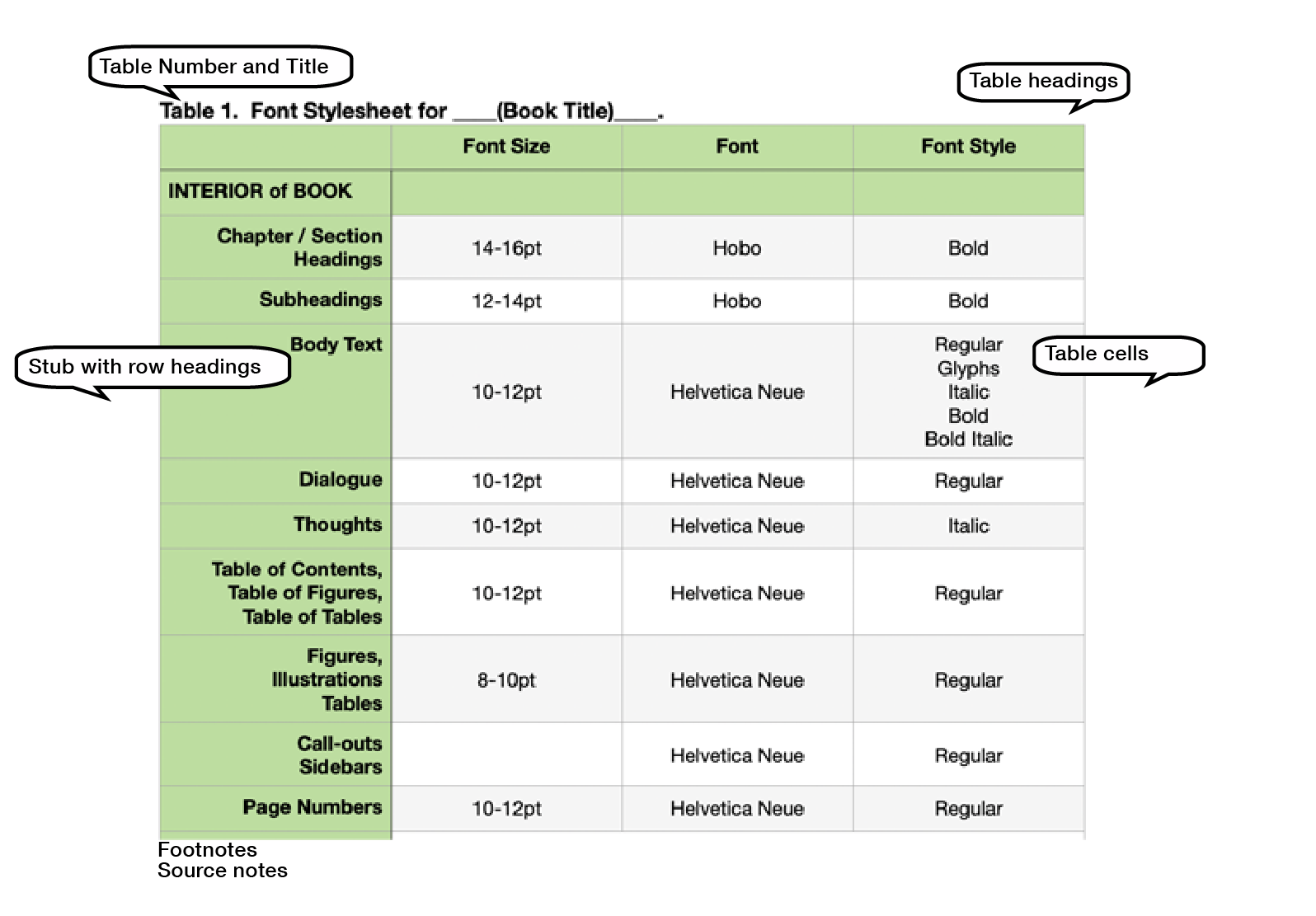
Fig. 9. Table Basics. |
|||||||||||||||||||||||
| Table Title & Number | Definition: A descriptive title/caption above the table that conveys information to the reader about the “story” being told with the table without the reader having to read anything else on the page. | |||||||||||||||||||||||
|
Return to top or post contents |
All tables require a caption/title and use the same source labeling conventions.
See Figure 9. Rule: Placed at the top of the table and left-aligned (depending upon the style guide you’re using). Rule: Use Table xx. to begin the title:
A.k.a. caption Source: Last |
|||||||||||||||||||||||
| Table Heading | Definition: Title of a table column or row. | |||||||||||||||||||||||
|
Return to top or post contents |
Usually 1-2 font sizes smaller than text and in bold.
See Figure 9. A.k.a. header |
|||||||||||||||||||||||
| Table Cell | Definition: The smallest unit in a table, organized into rows and columns. | |||||||||||||||||||||||
|
Return to top or post contents |
Each cell can contain text, numbers, images, or other types of content.
Usually 1-2 font sizes smaller than text and NOT bold. If the text is minimal, it should be centered. If the text is lengthy, left-align it. See Figure 9. |
|||||||||||||||||||||||
| Table Note | Definition: An optional additional description below the table that goes beyond the information in the table title/caption or body. | |||||||||||||||||||||||
|
Return to top or post contents |
Examples include definitions of abbreviations, explanations of asterisks used to indicate p values, color code explanations, etc.
Usually 1-2 font sizes smaller than text and NOT bold. Depending upon the style guide, the text may be left-aligned or centered. A.k.a. footer |
|||||||||||||||||||||||

Fig. 10. EB1911 – Ship – Table II, 1 January 1911, by the Encyclopædia Britannica (11th ed.), v. 24, 1911, “Ship,” article; p. 872, which is in the public domain, via Wikimedia Commons. |
||||||||||||||||||||||||
| Footnote | Definition: A note of source information, reference, explanation, or comment placed at the bottom of a page that corresponds to a superscript number found on the same page. | |||||||||||||||||||||||
| Uses 9- to 10-pt, although the current preference is the same size as your text.
An endnote provides the same information corresponding to a matching superscript number on a particular page but is located on its own page at the end of the document or book in the back matter. Endnotes in the back matter use the same size as the body. |
||||||||||||||||||||||||
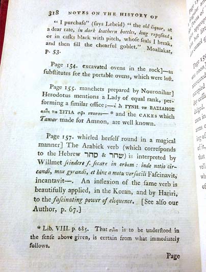
Fig. 11. Footnote to an Arabian Tale by Early Novels Database is under the CC BY 2.0 license, via Flickr. |
||||||||||||||||||||||||
Fig. 12. Endnotes Back Matter Example as styled per the Chicago Manual of Style. |
||||||||||||||||||||||||
C’mon, get it out of your system, bitch, whine, moan . . . which words are your pet peeves? Also, please note that I try to be as accurate as I can, but mistakes happen or I miss something. Email me if you find errors, so I can fix them . . . and we’ll all benefit!
Satisfy your curiosity about other Book Layout & Formatting Ideas by exploring its homepage or more generally explore the index of self-editing posts. You may also want to explore Formatting Tips, Grammar Explanations, Linguistics, Publishing Tips, the Properly Punctuated, Word Confusions, Writing Ideas and Resources, and Working Your Website.
Resources for Choosing Fonts for Your Book
Arruda, Ryan. “5 More Sneaky Typography Errors to Watch Out For.” Dribble.com. 17 Sept 2019. Accessed 4 Jan 2024. <https://dribbble.com/stories/2019/09/17/5-more-sneaky-typography-errors-to-avoid>.
Baker, Jason. “Top 5 Sources for Open Source Fonts.” OpenSource.com. 25 Feb 2016. Accessed 24 Nov 2023. <https://opensource.com/life/16/2/top-sources-open-source-fonts>.
“Book Cover Fonts.” FontSpace. n.d. Accessed 7 Jan 2024. <https://www.fontspace.com/category/book-cover>.
“Book Cover Fonts: How to Select the Perfect Typeface for Your Genre (with Examples and Resources).” ebook launch. n.d. Accessed 7 Jan 2024. <https://ebooklaunch.com/book-cover-fonts/>.
Bringhurst, Robert. The Elements of Typographic Style, ver. 3. Originally published 1992. Hartley & Marks, 2004. <https://smallpressblog.files.wordpress.com/2017/11/bringhurstelementsselections1.pdf>. PDF.
Chapman, Cameron. “The Best Book Cover Fonts to Use Right Now.” The Book Designer.com. 30 Sept 2023. Accessed 7 Jan 2024. <https://www.thebookdesigner.com/the-best-book-cover-fonts-to-use-right-now/>.
⸻. “Book Cover Design Awards — Autumn 2023 Edition.” The Book Designer. 30 Nov 2023. Accessed 7 Jan 2024. <https://www.thebookdesigner.com/book-cover-design-awards-autumn-2023/>. The awards explains what that book cover got right. The previous list also noted books that got it wrong, and I do miss this.
⸻. “Tips and Considerations When Choosing a Typeface (with Infographic).” Toptal. n.d. Accessed 8 Dec 2023. <https://www.toptal.com/designers/typography/choosing-a-typeface-infographic.>.
“CSS Fonts.” W3Schools. n.d.. Accessed 6 Dec 2023. <https://www.w3schools.com/css/css_font.asp>.
davelab6. “OFL.txt.” GitHub. n.d. Accessed 24 Nov 2023. <https://github.com/google/fonts/blob/main/ofl/inconsolata/OFL.txt>.
DeFilippo, Michele. “The Best Fonts for Books.” IngramSpark. 26 May 2021. Accessed 20 Nov 2023. <https://www.ingramspark.com/blog/best-fonts-for-books>.
Field Guide to Fonts for Ebooks. Originally published 2014. Book Industry Study Group, Inc. ISBN: 978-1-936757-31-2. <https://www.bisg.org/products/field-guide-to-fonts-for-ebooks>. Ebook. A free download from BISG that addresses how to ensure your custom fonts will display correctly on various devices and reading systems.
“Font Identifier.” Font Squirrel. n.d. Accessed 2 Jan 2024. <https://www.fontsquirrel.com/matcherator>. Allows you to upload the image of a font, and it will search for the closest match.
“Font Licensing.” Adobe Fonts. 11 July 2023. Accessed 17 Nov 2023. <https://helpx.adobe.com/fonts/using/font-licensing.html#act-comm>.
Franz, Laura. “Size Matters: Balancing Line Length And Font Size In Responsive Web Design.” Smashing Magazine. 29 Sept 2014. Accessed 2 Jan 2024. <https://www.smashingmagazine.com/2014/09/balancing-line-length-font-size-responsive-web-design/>.
Hermann, Ralf. “The @Font-Face Rule And Useful Web Font Tricks.” Smashing Magazine. 2 Mar 2011. Accessed 2 Jan 2024. <https://www.smashingmagazine.com/2011/03/the-font-face-rule-revisited-and-useful-tricks/>.
Last, Suzan. “3.4 Figures and Tables.” Pressbooks. BCcampus. n.d. Accessed 5 Jan 2024. <https://pressbooks.bccampus.ca/technicalwriting/chapter/figurestables/>.
Lieurance, Suzanne. “What is a Sidebar?” Writers on the Move. n.d. Accessed 4 Jan 2024. <https://www.writersonthemove.com/2013/06/what-is-sidebar.html>.
Murphy, Derek. “What Font Should You Use on Your Book Cover Design? Check This Awesome List of Best Fonts Per Genre!” FIY Book Covers.com. n.d. Accessed 7 Jan 2024. <https://diybookcovers.com/what-font-should-you-use-on-your-book-cover-design-check-this-awesome-list-of-best-fonts-per-genre/>.
“The Original, the First, the Open-source Font Foundry.” The League of Moveable Type. n.d. Accessed 3 Jan 2024. <https://www.theleagueofmoveabletype.com>.
The Scribe Crew. “Book Cover Fonts: How to Choose One That Converts.” Book Publishing. Scribe Media. n.d. Accessed 7 Jan 2024. <https://scribemedia.com/book-cover-fonts/>.
⸻. “6 Great Book Cover Examples (& Where To Find Images).” Book Publishing. Scribe Media. n.d. Accessed 7 Jan 2024. <https://scribemedia.com/book-cover-images/>.
“Table Setup.” APA Style. Dec 2021. Accessed 5 Jan 2024. <https://apastyle.apa.org/style-grammar-guidelines/tables-figures/tables>.
“Typeface and Font for Book Covers.” Cover Design Sutdio.com. n.d. Accessed 7 Jan 2024. <https://www.coverdesignstudio.com/typeface-font-book-covers/>.
Wiberg, Karin. “Self-Publishing? Avoid These Common Book Layout Mistakes.” WEBSITE. 31 Oct 2019. Accessed 4 Jan 2024. <https://clearsightbooks.com/common-book-layout-mistakes/>.
Wilson, Pamela. “Are You Falling for Font Falsehoods? What Matters for Picking the Best Font Size.” Pamela Wilson.com. n.d. Accessed 2 Jan 2024. <https://www.pamelawilson.com/best-font-size/>.
Resources on Pairing Fonts
Bonneville, Douglas. “Best Practices Of Combining Typefaces.” Smashing Magazine. 4 Nov 2010. Accessed 2 Jan 2024. <https://www.smashingmagazine.com/2010/11/best-practices-of-combining-typefaces/>. A great post on combining sans-serif fonts with serif fonts for complementary headings with body text.
“Canva’s Ultimate Guide to Font Combinations.” Canva. n.d. Accessed 2 Jan 2024. <https://designschool.canva.com/blog/the-ultimate-guide-to-font-pairing/>. A useful post on pairing two serif fonts within nonfiction body text.
Tiano, Stephen. “Pairing Typefaces in Book Design.” David Airey.com. 4 Mar 2011. Accessed 2 Jan 2024. <http://www.davidairey.com/typeface-combinations-book-design/>.
“Try These Free Google Font Pairings.” Fontpair. n.d. Accessed 1 Jan 2024. <https://www.fontpair.co/all>. A fun browse for ideas.
Resources for Free Fonts
Canva. <https://www.canva.com/learn/50-free-commercial-fonts/>.
Font Squirrel. <https://www.fontsquirrel.com/fonts/list/find_fonts>.
Fontesk. <https://fontesk.com/license/free-for-commercial-use,ofl-gpl/>. Be sure to click the link to “free for commercial use”.
Fontshare. <https://www.fontshare.com/licenses/sil-ofl>.
Hilder, Rose. “The Best Places to Download Free fonts.” Creative Bloq.com. 12 Oct 2023. Accessed 4 Jan 2024. <https://www.creativebloq.com/typography/download-free-fonts-resources-912696>
GNU FreeFont. <https://www.gnu.org/software/freefont/>.
Google Fonts. <http://google.com/fonts>.
Limcaco, Jad. “The Best Free Fonts for Designers.” Smashing Magazine. 19 July 2011. Accessed 4 Jan 2024. <https://www.smashingmagazine.com/2011/07/best-free-fonts-designers/&g;t.
SIL Open Source. <https://scripts.sil.org/cms/scripts/page.php?cat_id=FontDownloads>.
Resources for Commercial (Not-free) Fonts
Adobe Fonts. <https://fonts.adobe.com>. You have to pay the subscription fee to use these for “free”.
Creative Market. <https://creativemarket.com/free-goods>.
Envato Elements. <https://elements.envato.com/fonts>.
Fonts.com. <https://www.fonts.com/>.
FontShop. <https://www.fontshop.com>.
Fontspring. <https://www.fontspring.com/>. A combination of free and commercial.
Monotype. <https://www.monotype.com>.
MyFonts. <https://www.myfonts.com>.
Type Wolf. <https://www.typewolf.com>.
Pinterest Photo Credits:
My own work.